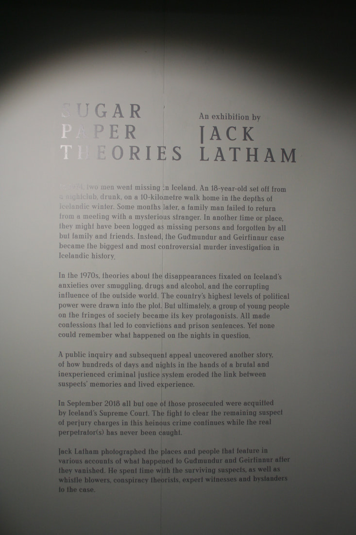
Exploring the Grey Area
When people refer or use the term "Grey Area" they mean that the topic is unclear or unexplored. This day to day frase can really help photographers fall into different unexplored genres of photography. A lot of photographers tend to create mysteriousness behind their photos which makes every single photo unique, and thats a big part of photography. Its to be unique and mysterious.
In the more recent photographers books that explore the grey area, the photographers really show you that photos are not always reliable.In early photography days you could not fake or Photoshop a picture, thats why people would think that a photo can't lie, because a photo lets you see something like you saw it with your own eyes. Even tho nowadays you can manipulate, Photoshop or even completely fake the photo, people still rely on photos being true. It can be really unreliable and uncertain about what you see in pictures that have two time frames past and present.
Jack Latham
Jack Latham is a British photographer, who is mainly a documentary photographer. All of his books have something mysterious included in them, but the mysteriousness comes from the fraze "Grey Area''. Latham likes to explore the unexplored areas of photography which is what makes his phonebooks that interesting. His two most recent books 'Sugar Paper Theories' and 'Parliament of Owls' started a big interest into the topic of 'Grey Area' in photography.
|
|
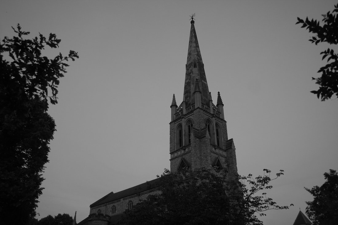
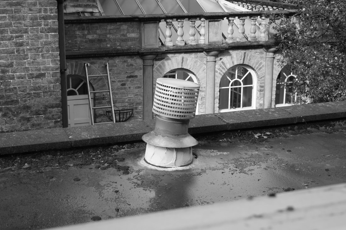
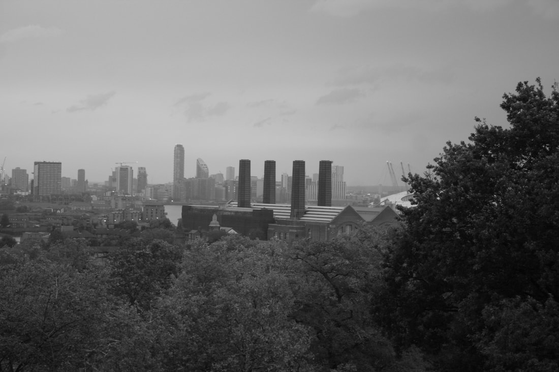
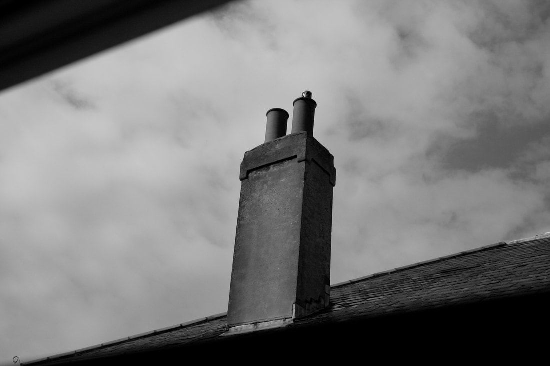
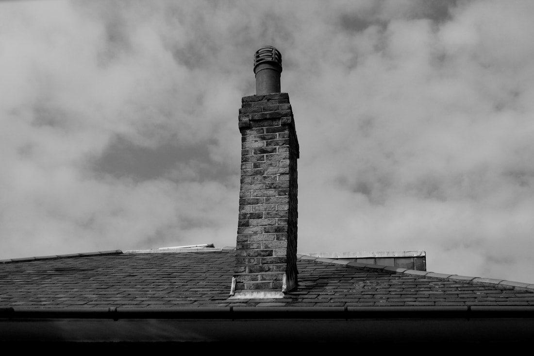
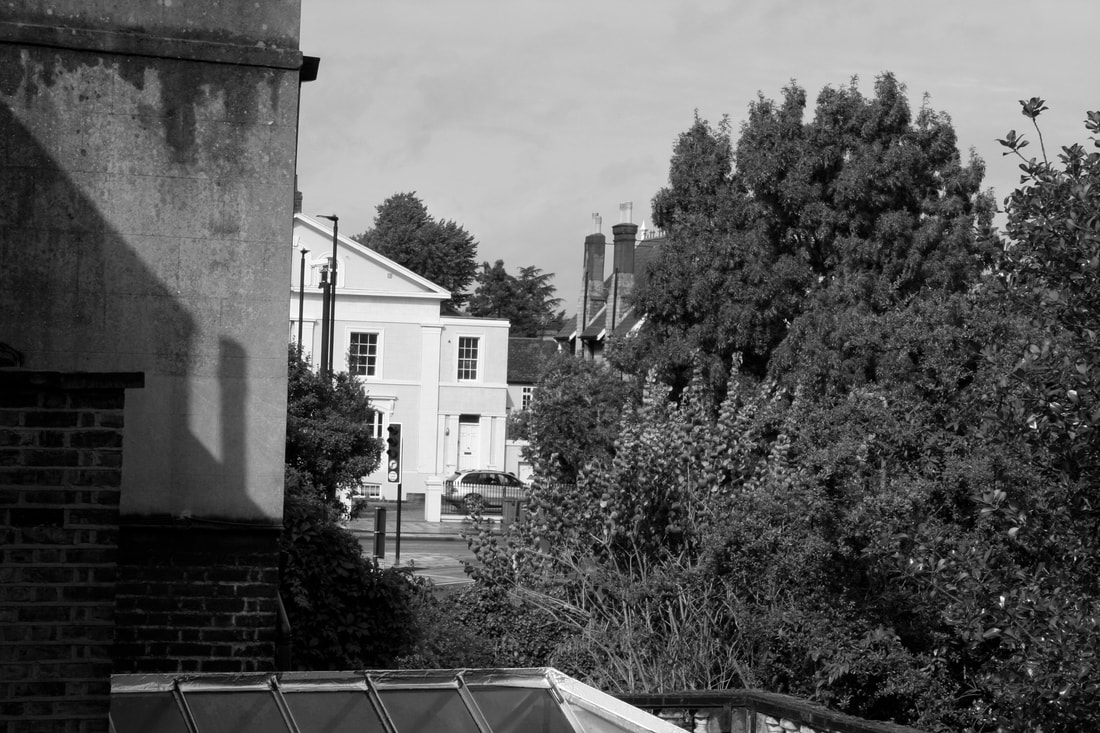
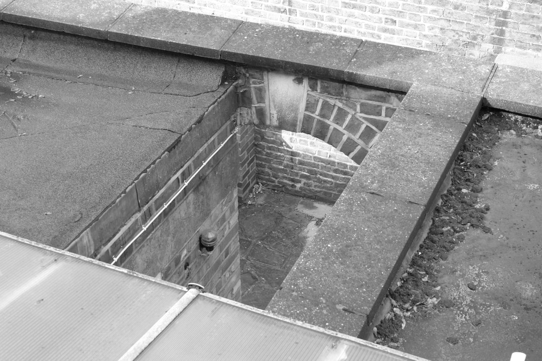
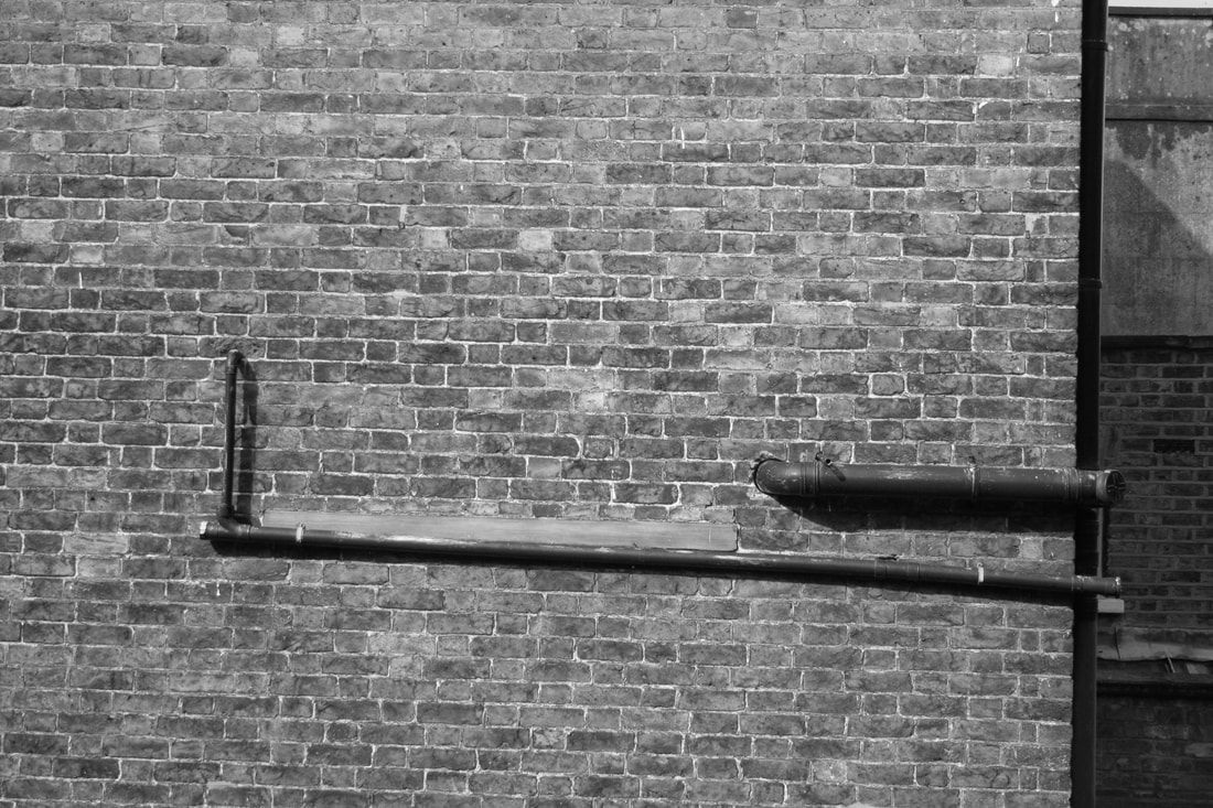
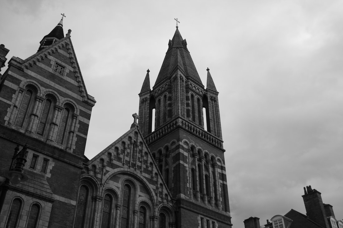
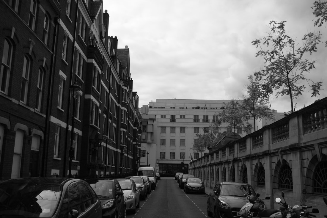
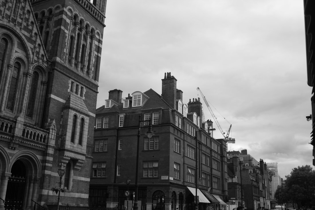
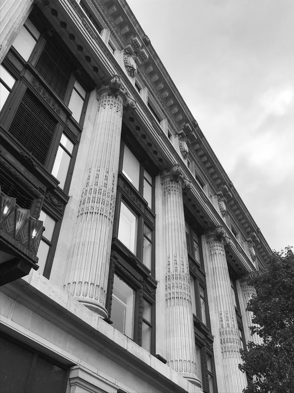
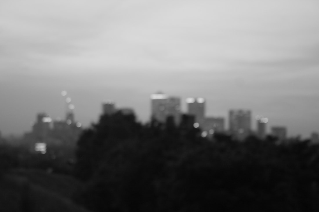
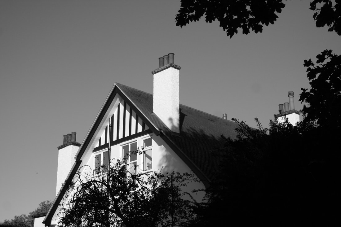
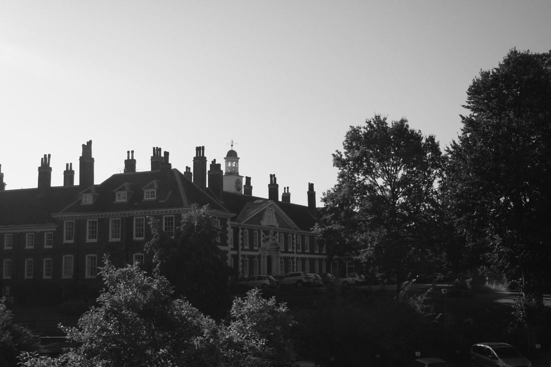
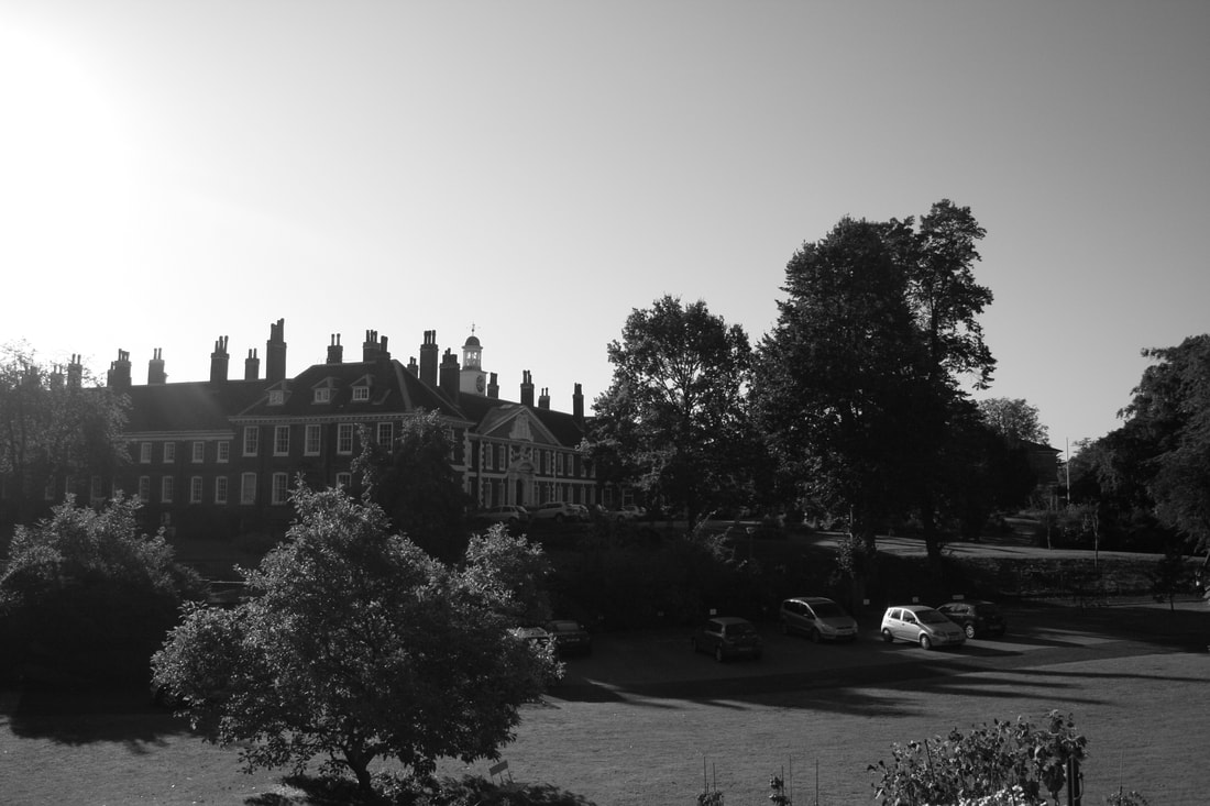
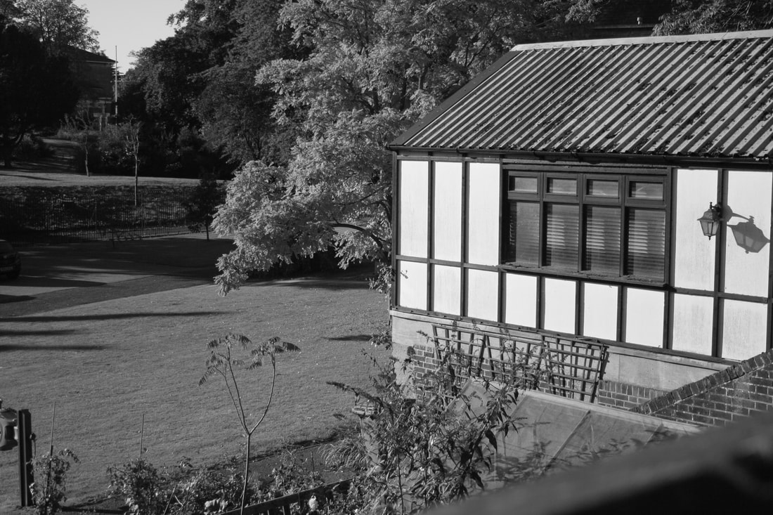
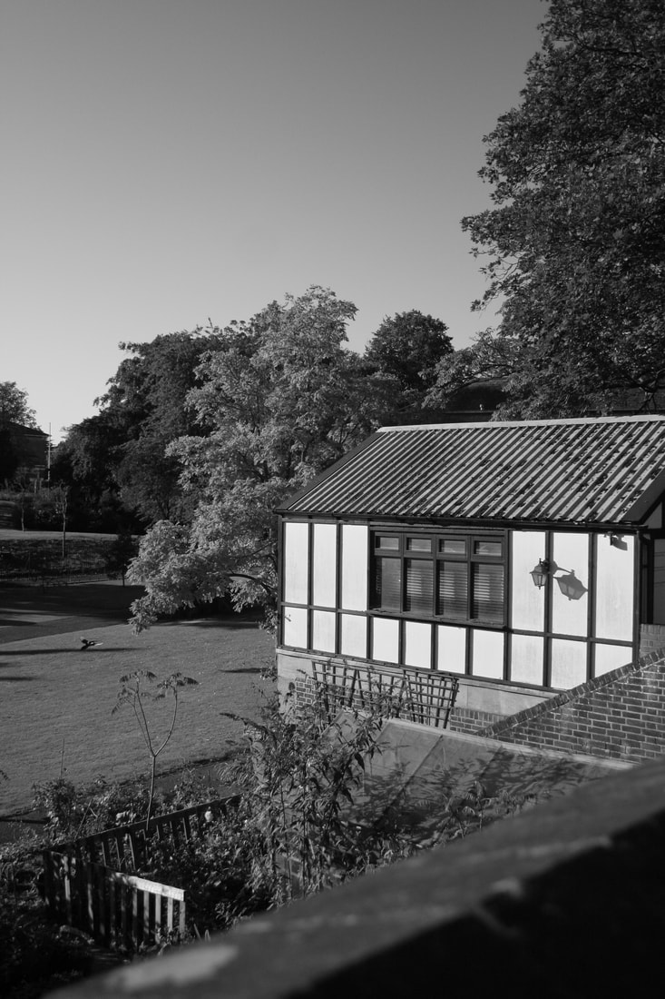
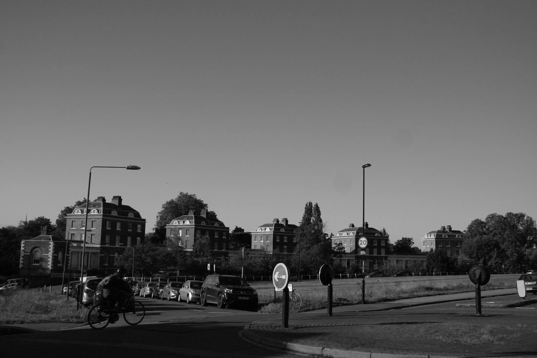
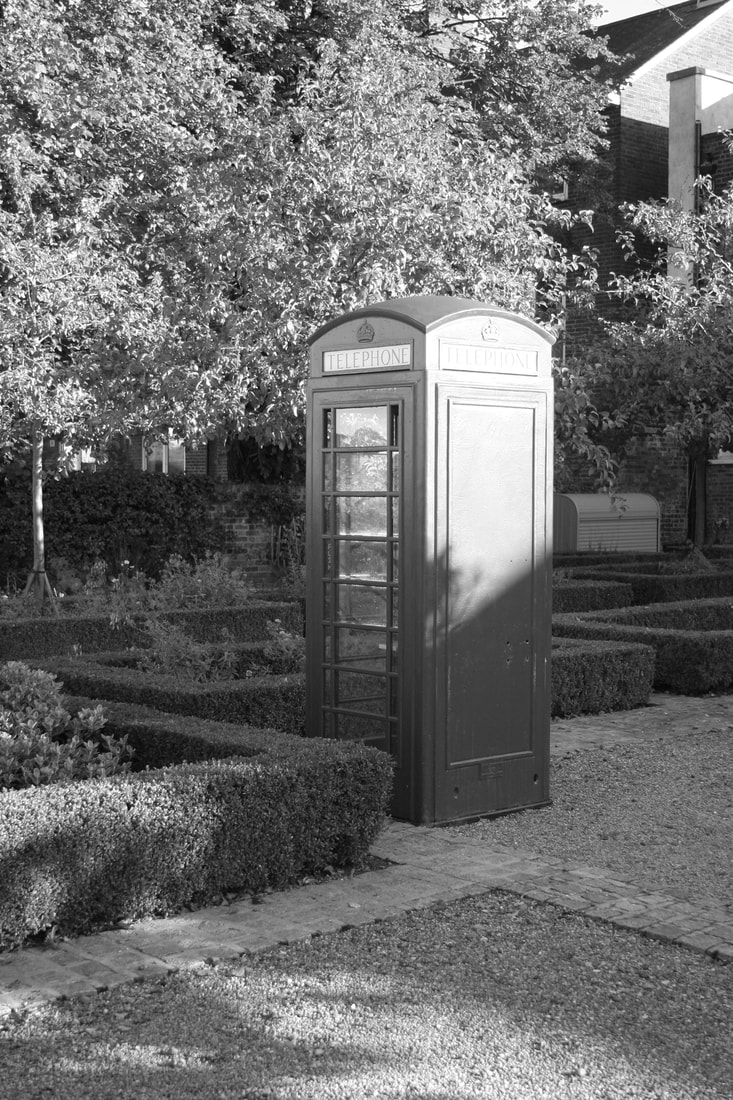
The Photoshoot
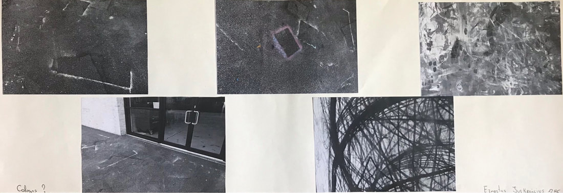
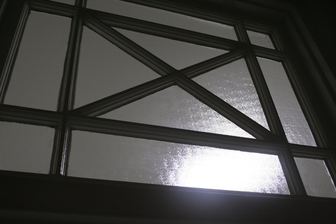
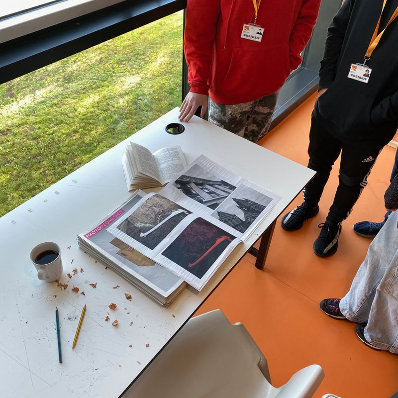
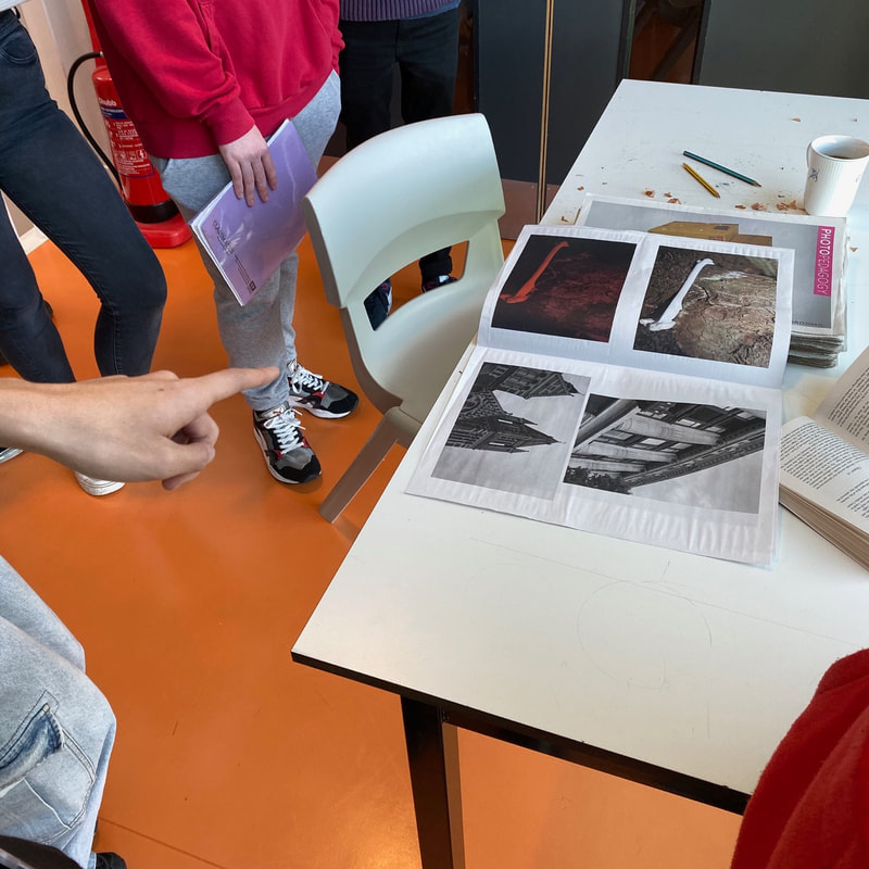
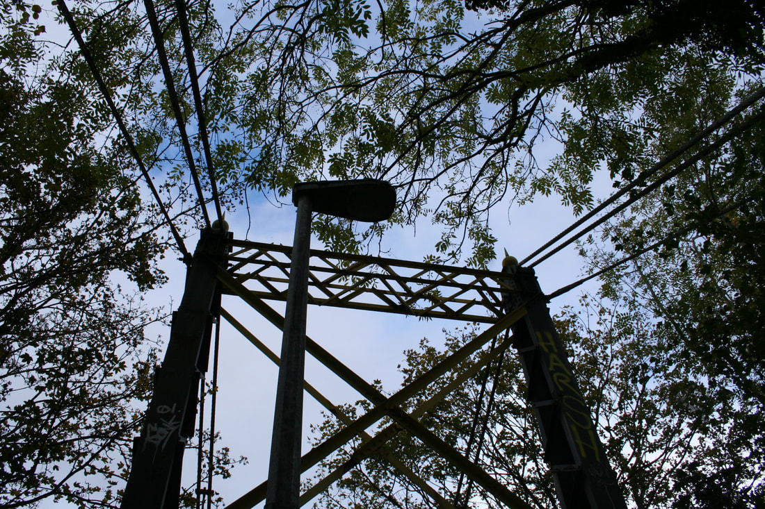
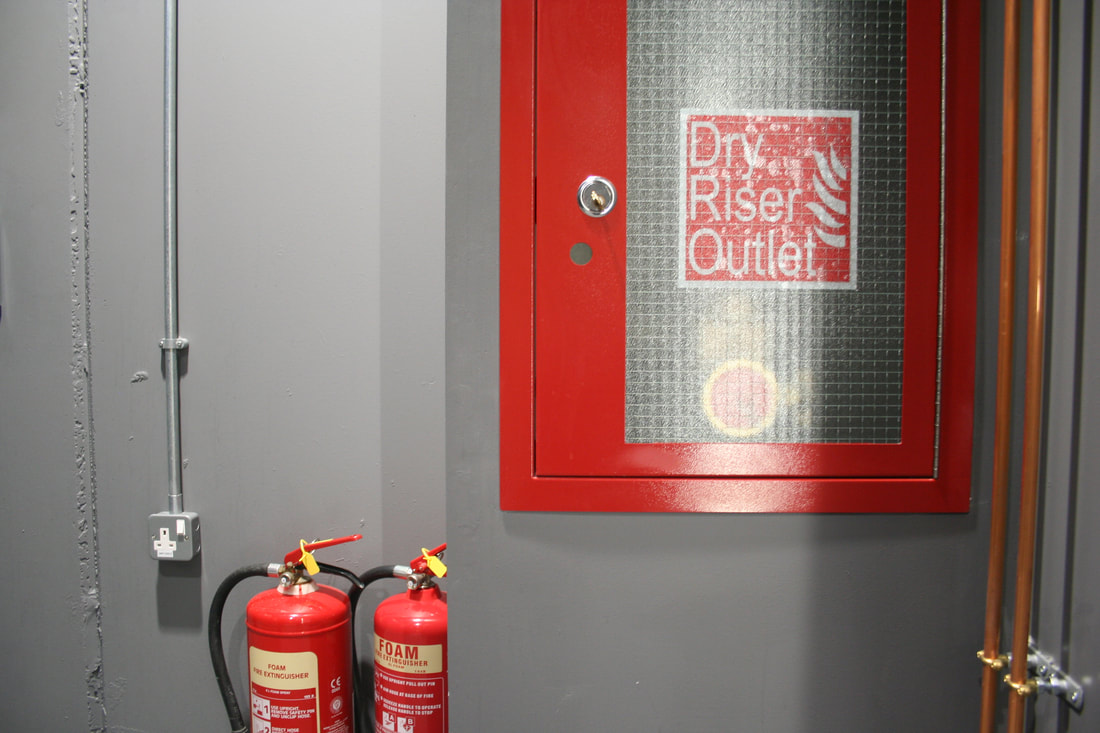
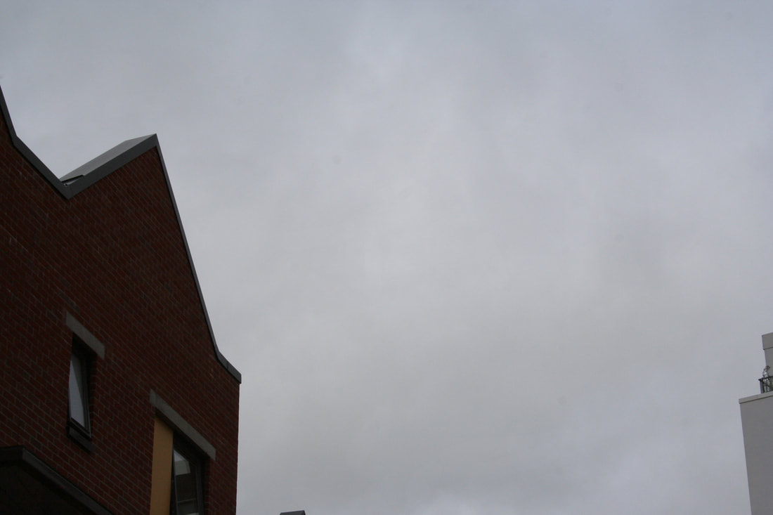
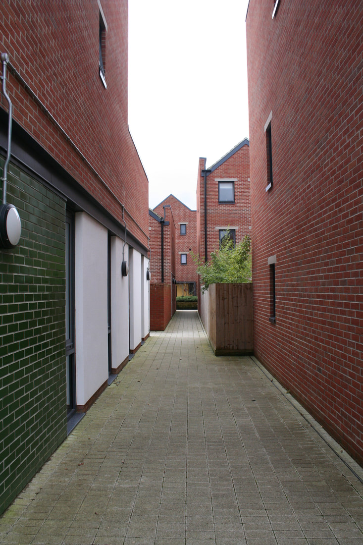
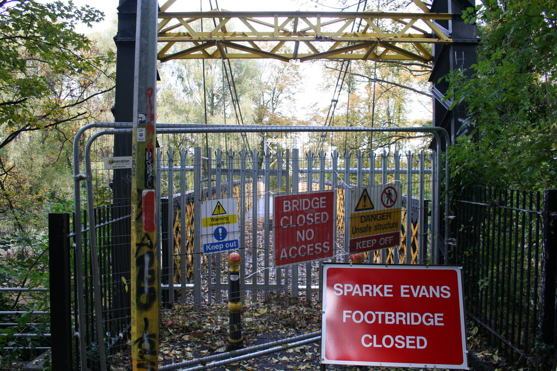
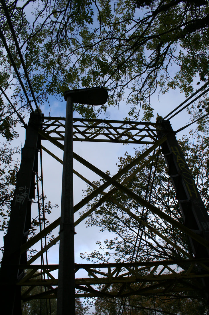
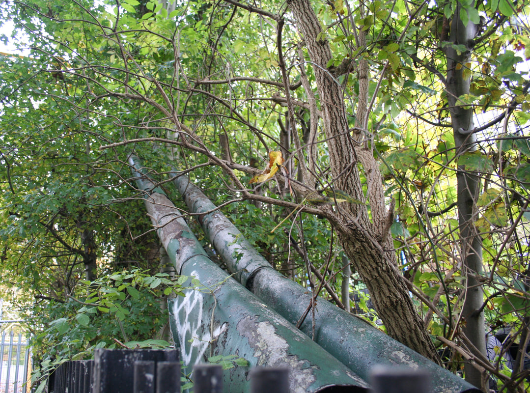
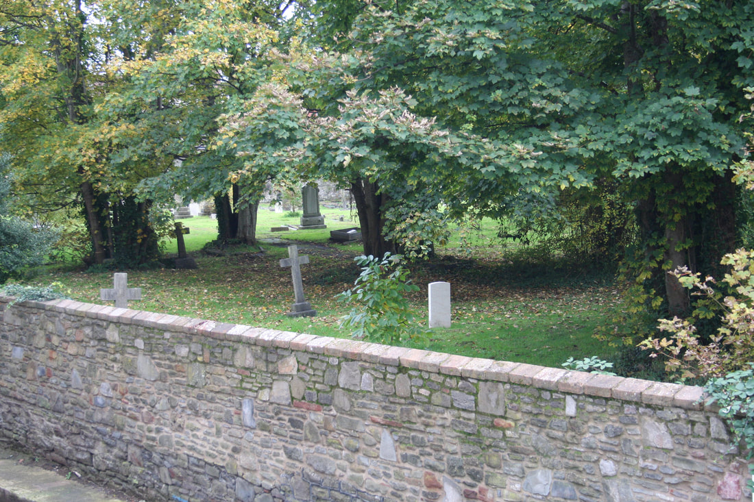
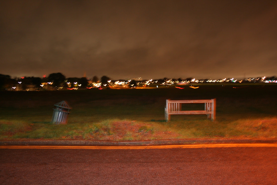
The photoshoot had the genre of still life. I went to different parts of London like Oxford Street, Canary Wharf, Blackheath to capture 'man-made' structures. The objects that were captured don't necessarily link to each other which raises the question and the suspicion of 'whats so important in the photos?'. I also wanted to explore everything in black and white because I never did any photos in black and white. I got the idea to do that from Jack Latham's 'Parliament of Owls'. What I like about my photos is that you can see the details in each structure very clearly, also next to some of the photos you will see some greenery like trees or bushes and that from my eyes represents the life next to those structures. My pictures also show a different genres of a landscape picture.
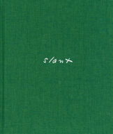
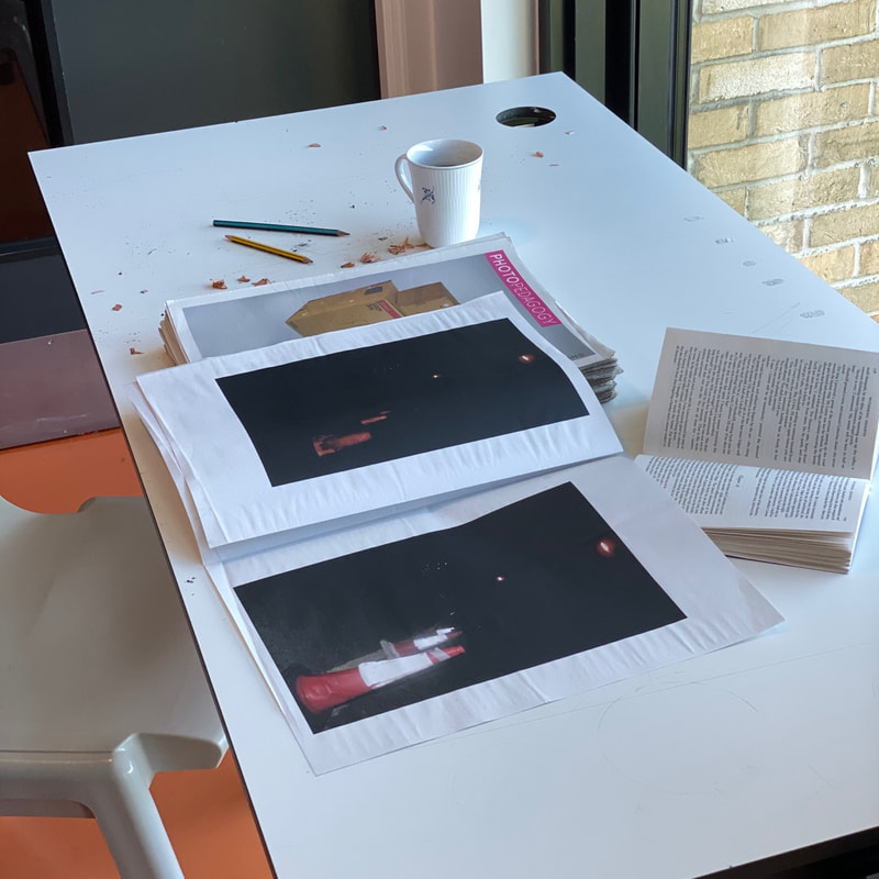
Arson- Response To Aaron Schuman's 'Slant'
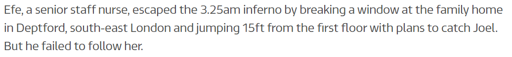
My pictures were based of a little 7 year old boy who tragically and unfortunately died in an arson. The boy died in his house when two people lit the house on fire because of a little feud with Joels older brother, while his and his older sister managed to escape the fire and the older (adult) brother was not living in the house at the time.
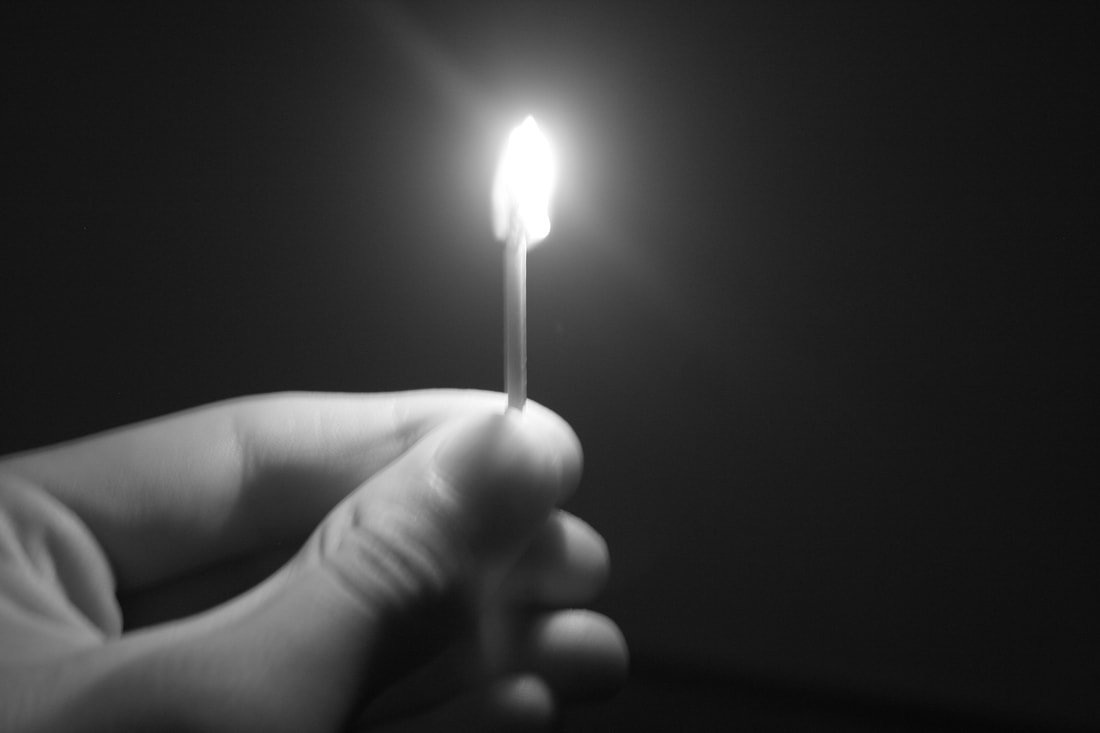
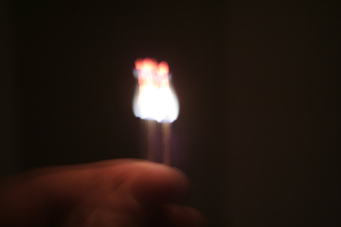
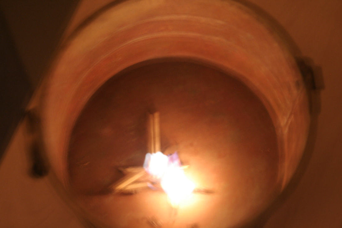
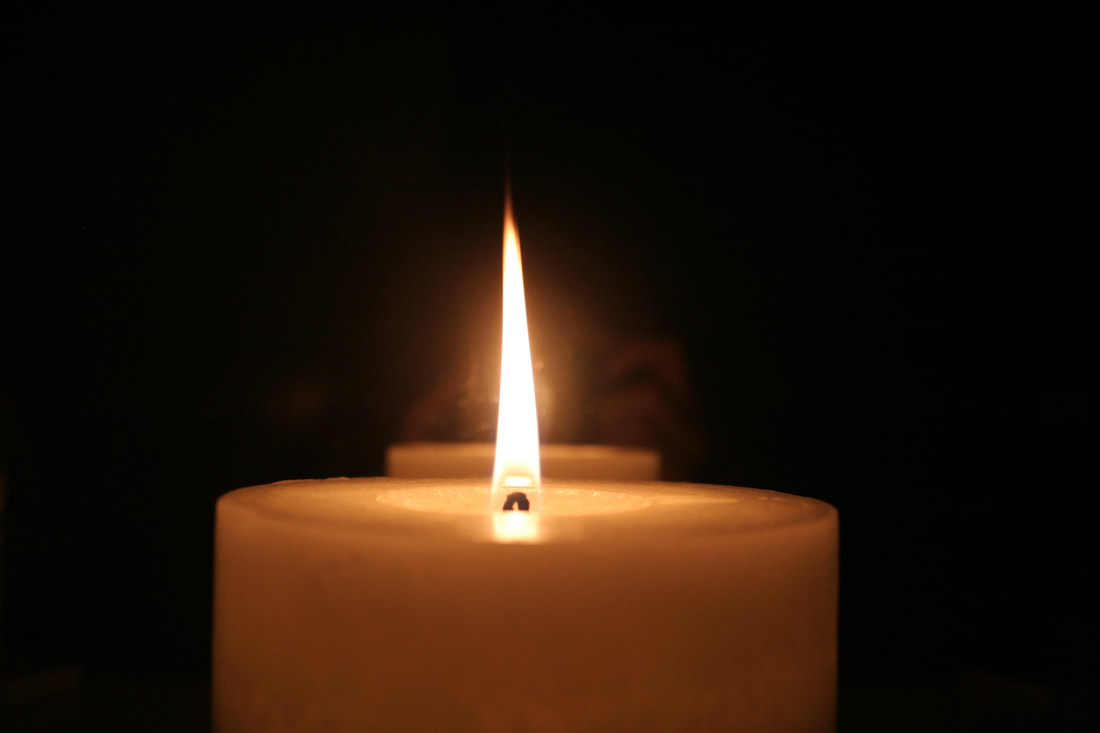
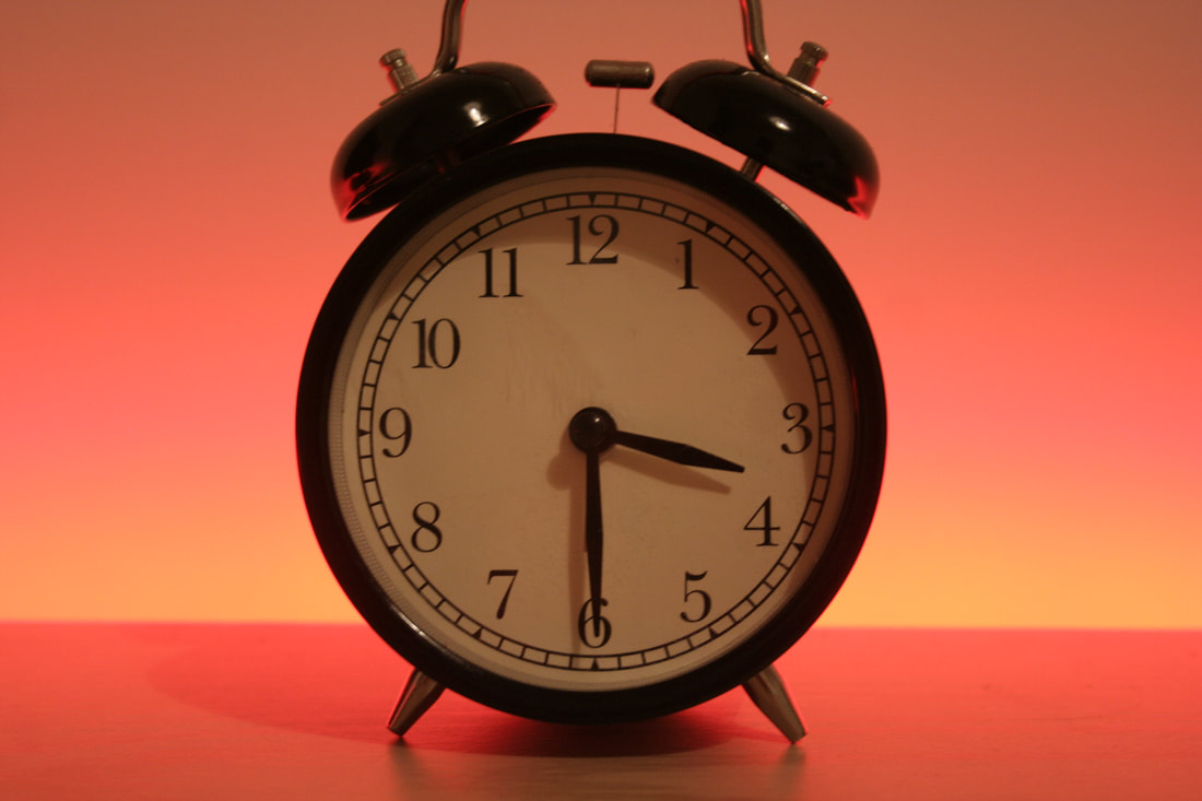
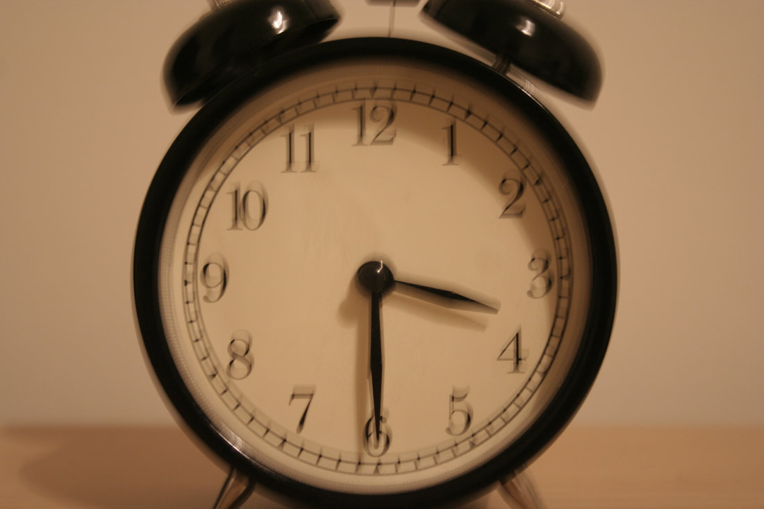
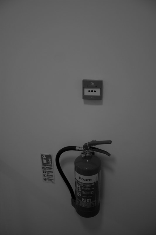
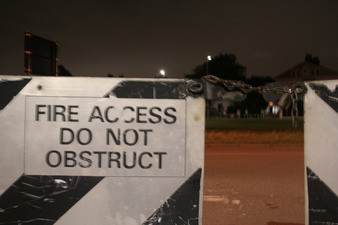
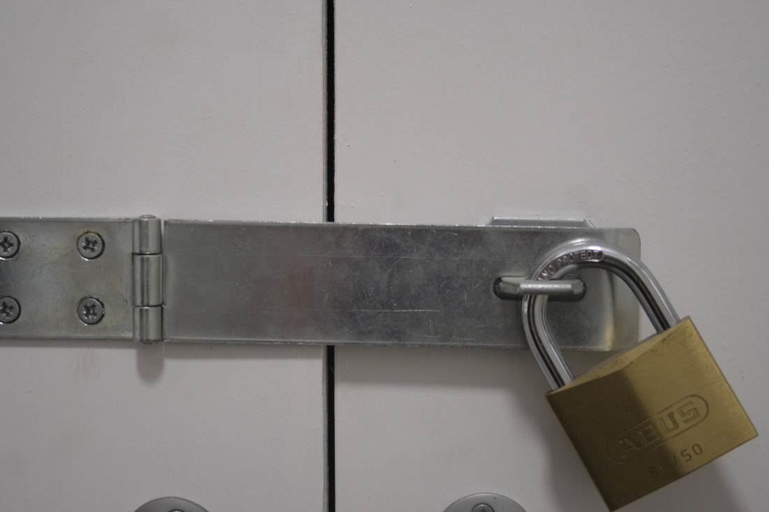
My pictures that I took represent the theme of danger. The idea behind the pictures was to use objects/props around me or somewhere far away to portray danger and mysteriousness. The colours in these images are used as "Alert colours" in day to day basis. I wanted to portray the different sides of fire, sometimes it can be warm and comforting, but sometimes it can be an example danger and tragedy. The blurriness in some of my images represent the stress of being in danger.
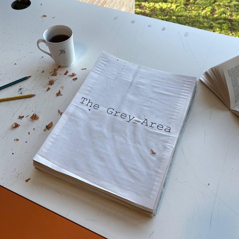
Exhibition - The Grey Area Newspaper
The first step of my preparation was to pick out around 10 best photos that explore/portray the Grey Area. My idea is to show the photos on a news paper. So I had to design a newspaper. I designed it using Adobe InDesign, The news paper front is going include the title of this project and the rest is going to be pictures that have two different themes, on theme is the exploration of danger and distress.
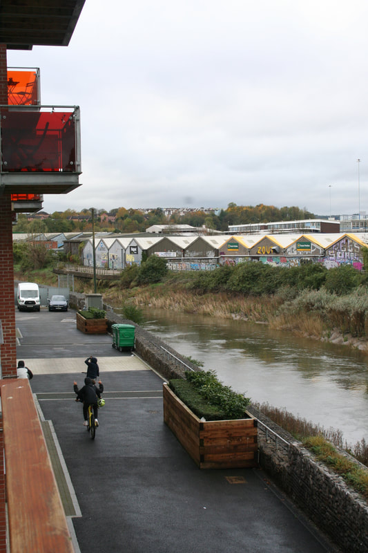
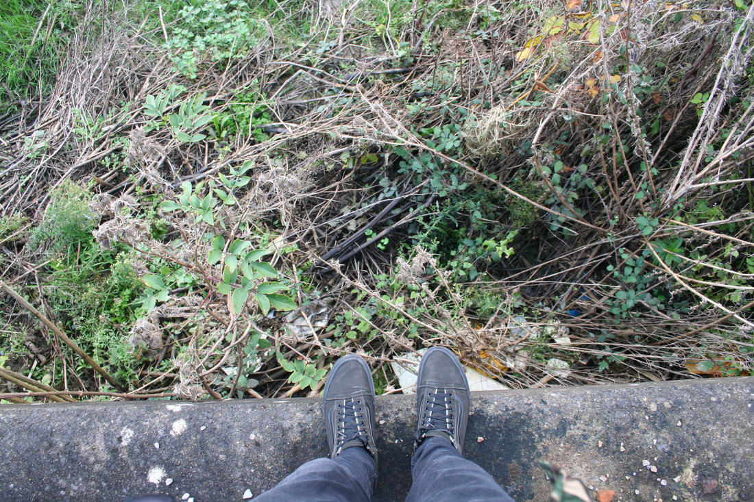
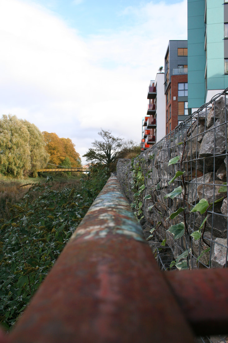
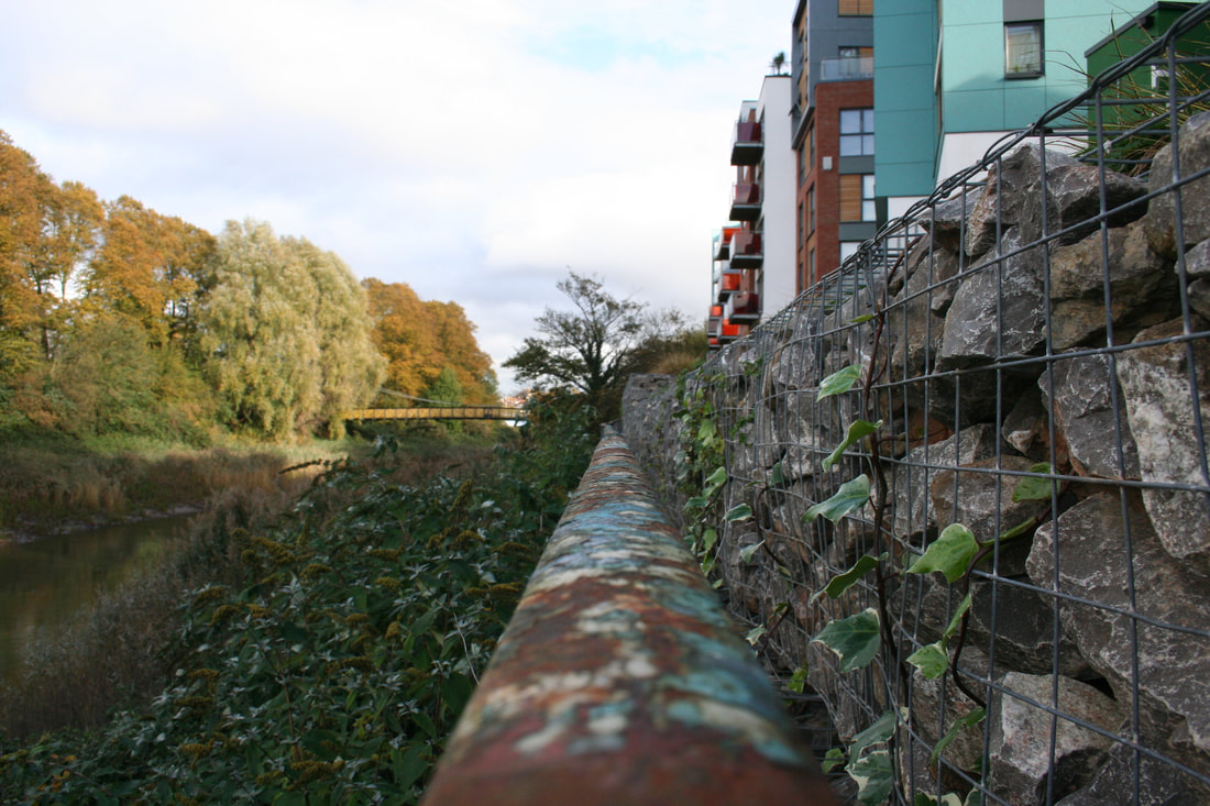
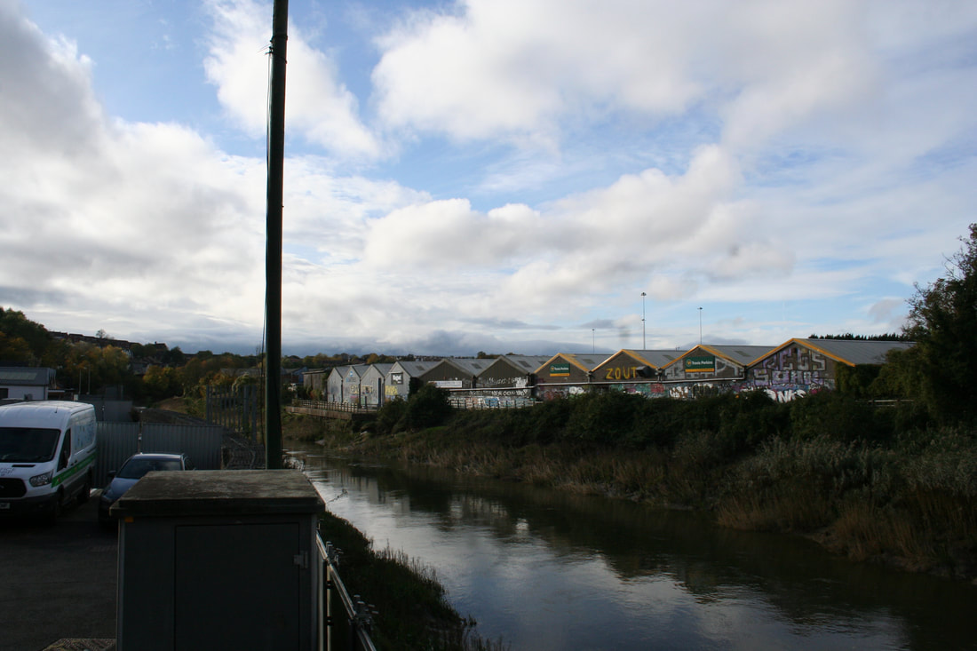
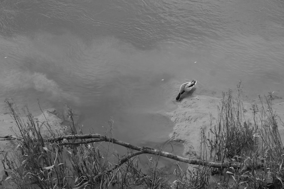
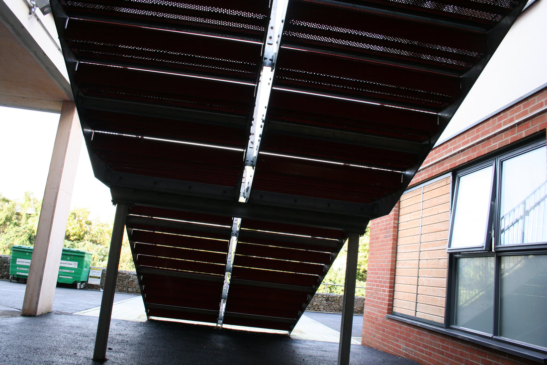
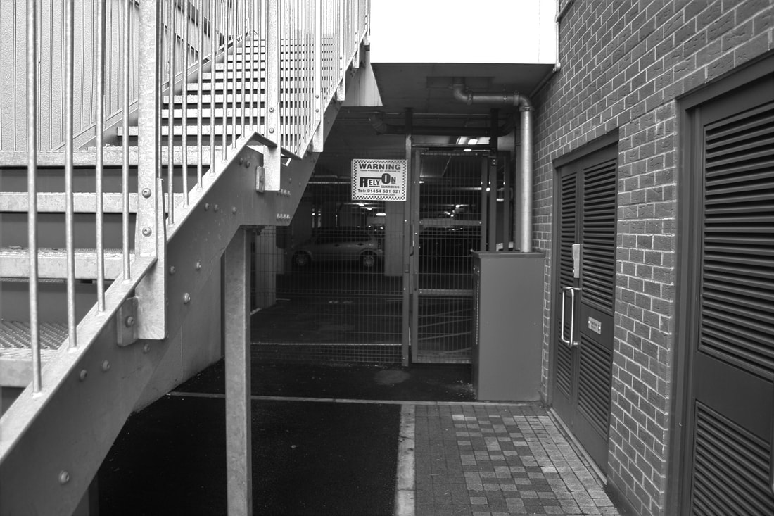
The Bristol Trip
We all received a task list of the pictures that we were supposed to take:
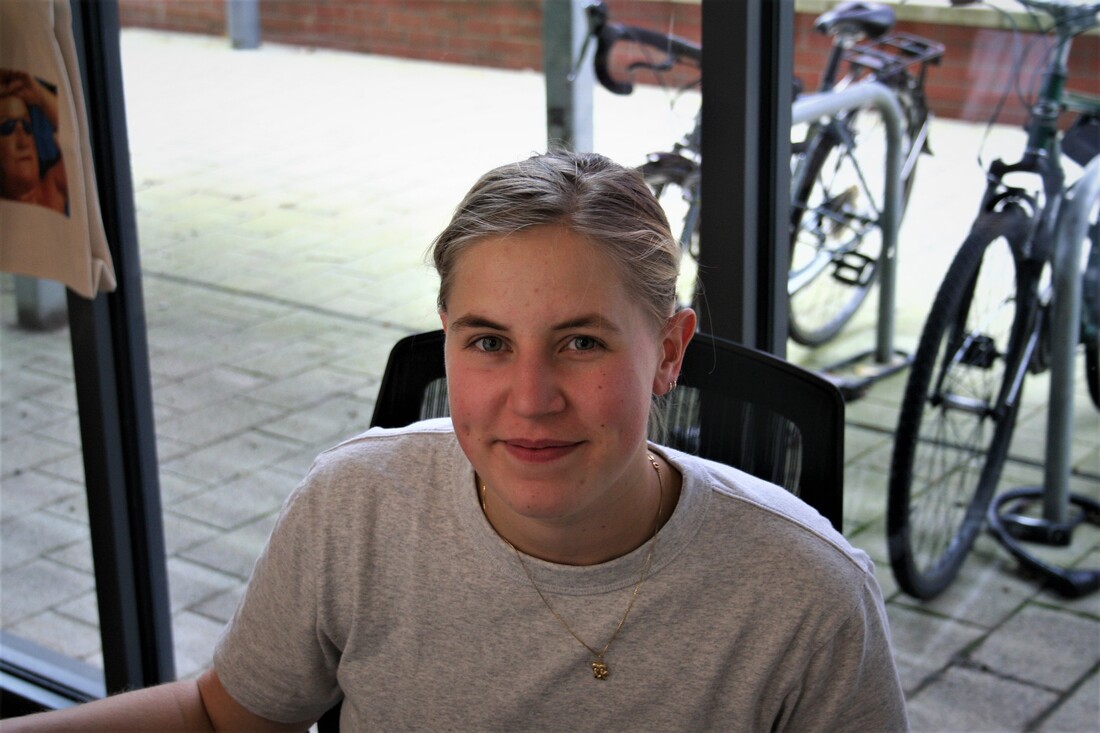
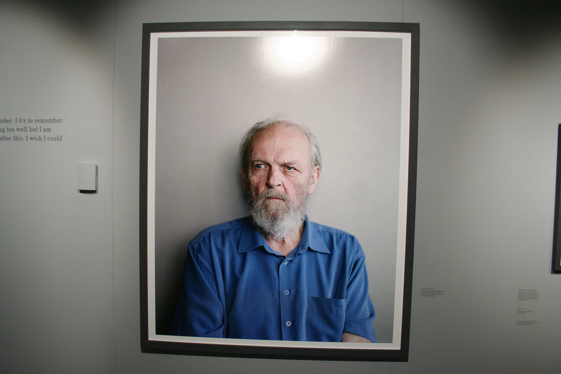
- A posed head and shoulders portrait photograph of a stranger
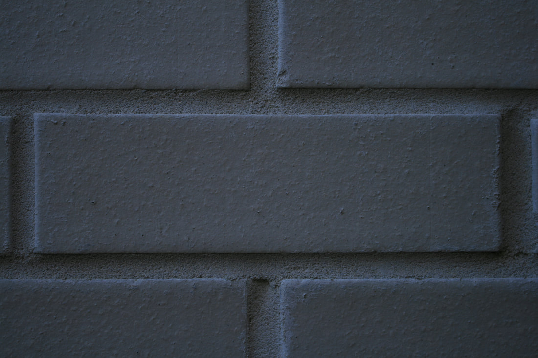
- A still life photograph of a brick in shallow focus
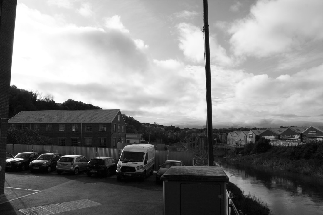
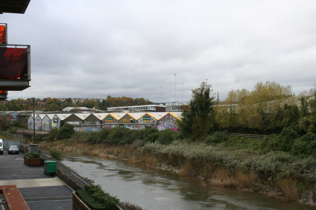
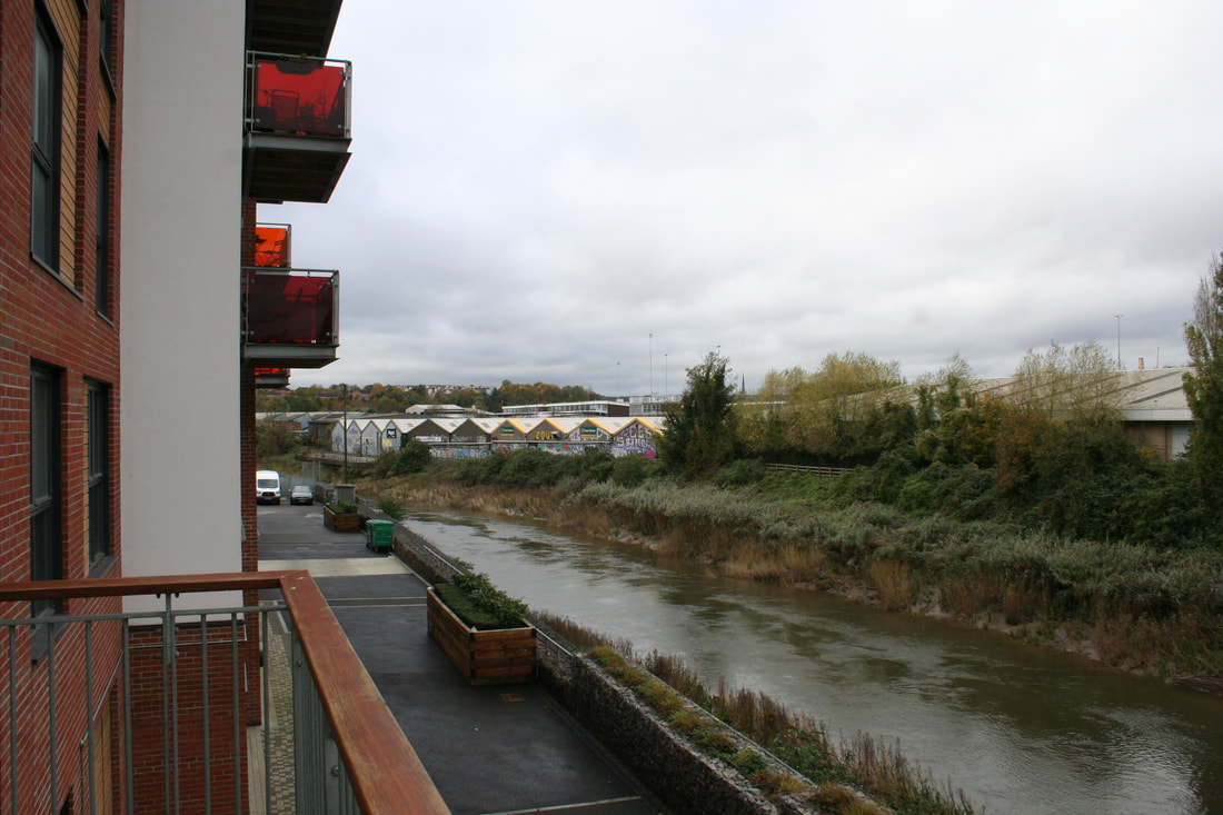
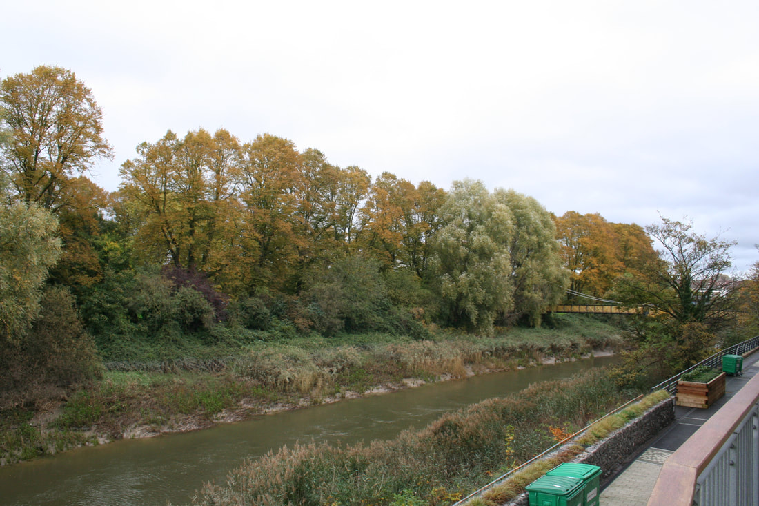
- A wide angle landscape photograph of the city
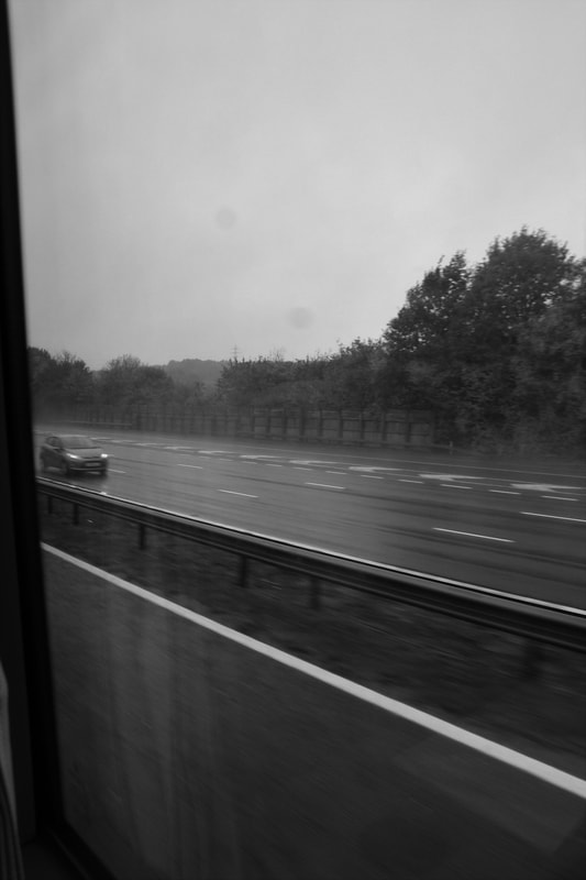
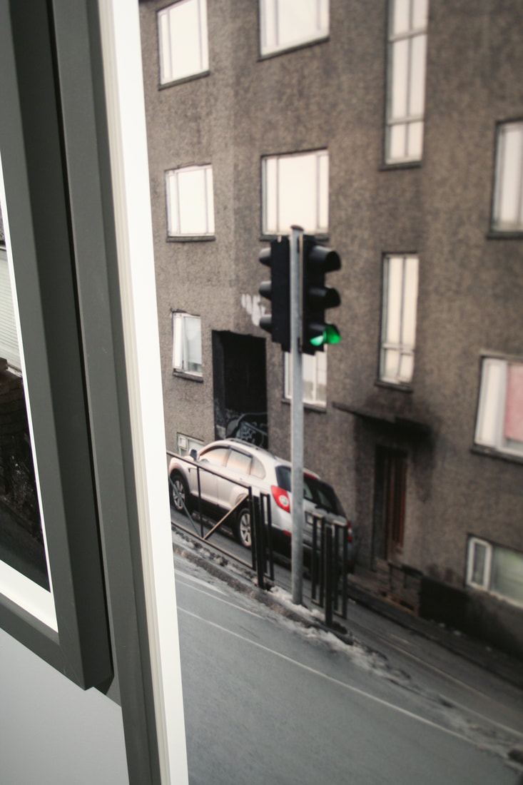
- A photograph taken of the motorway out of a moving coach window
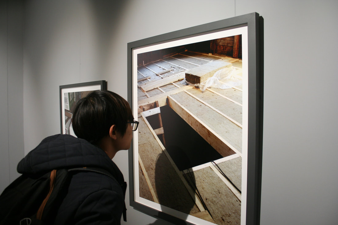
- A portrait photograph of someone looking carefully at something
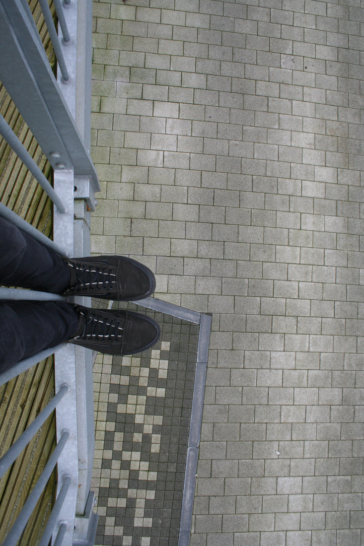
- A photograph shot from above of your shoes standing on the edge of something
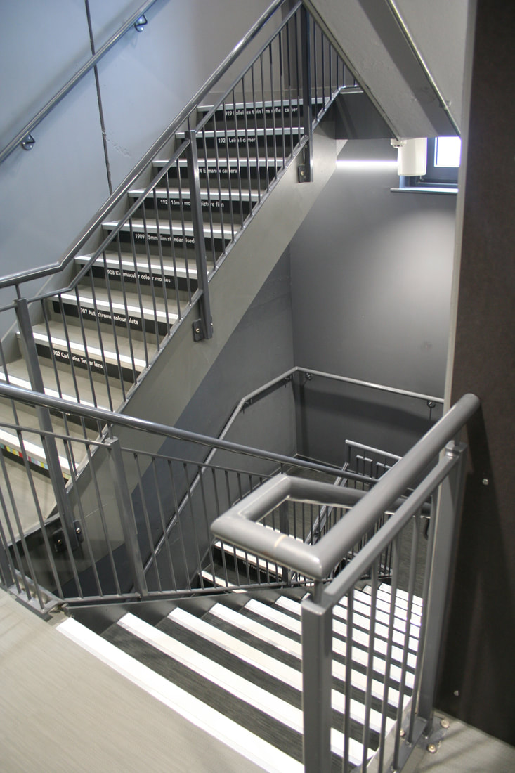
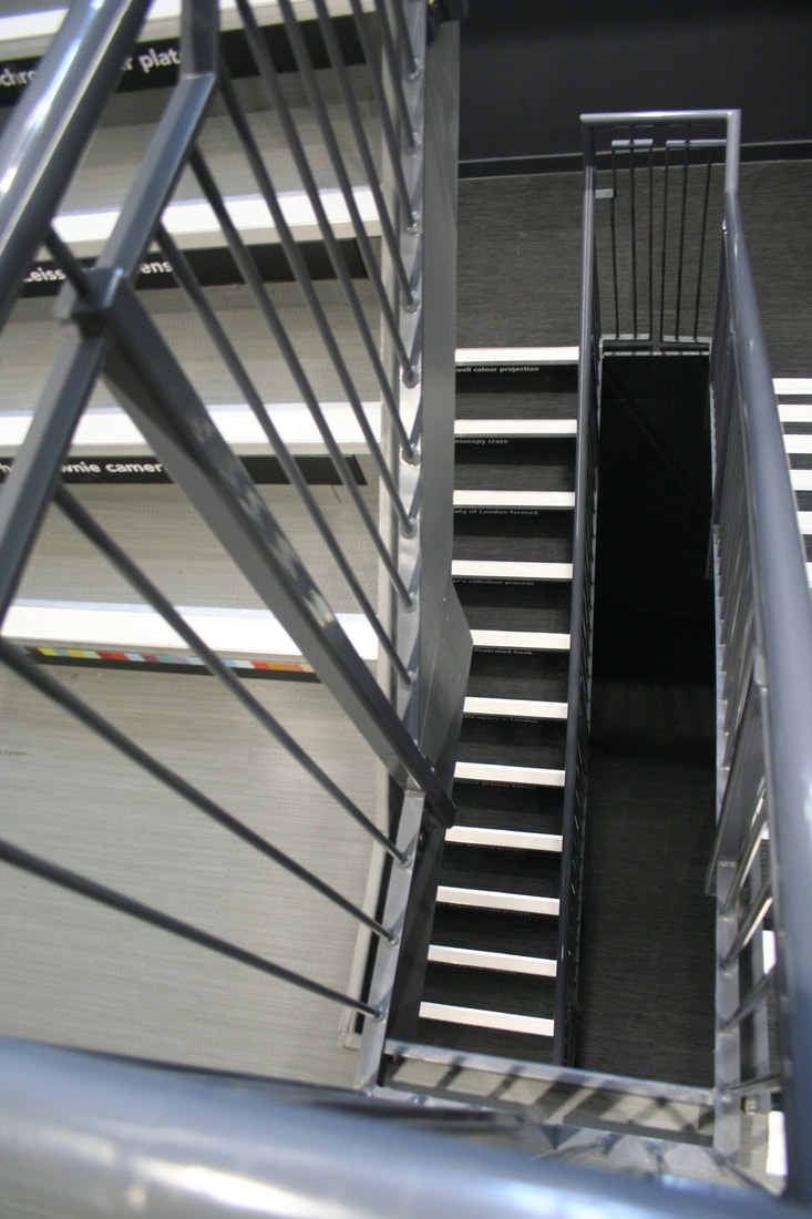
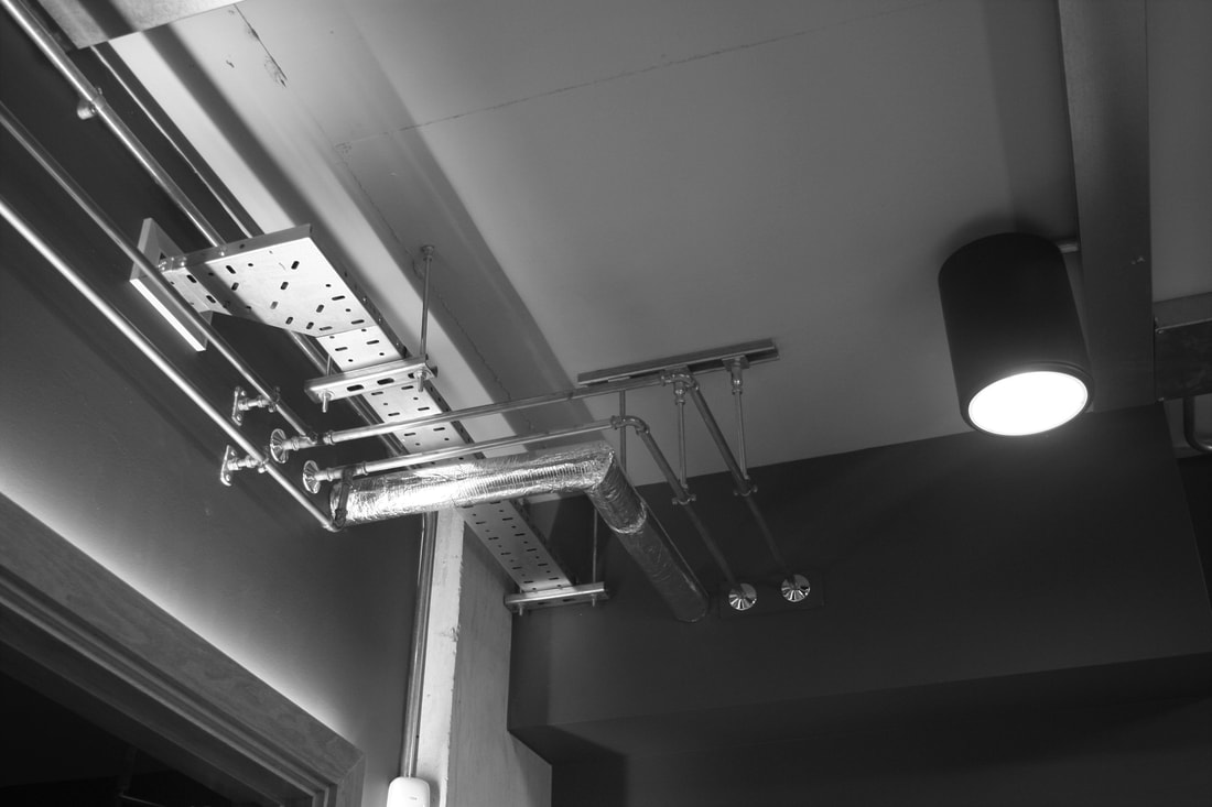
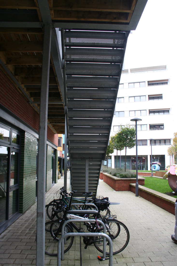
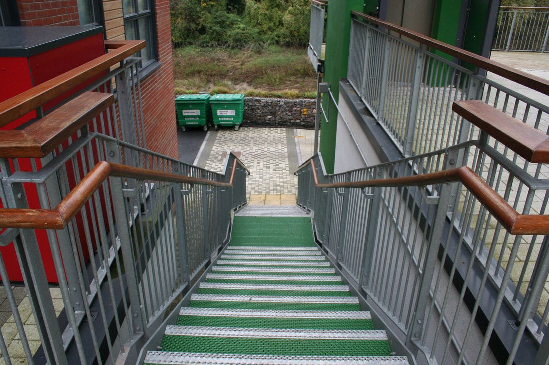
- An architectural photograph of a corridor or stairwell
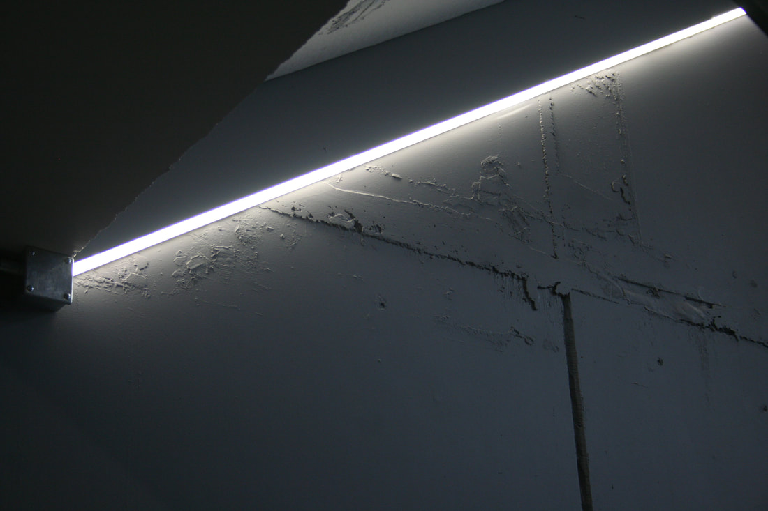
- An abstract photograph of light on surface
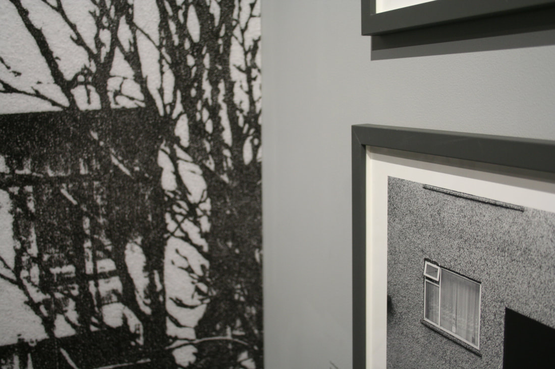
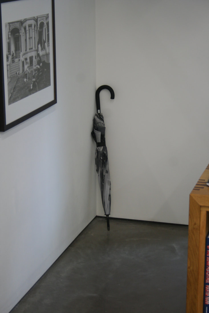
- A photograph of the corner of a framed photograph hinting at, but not fully revealing, its subject
- A close-up photograph of the word ‘fact’
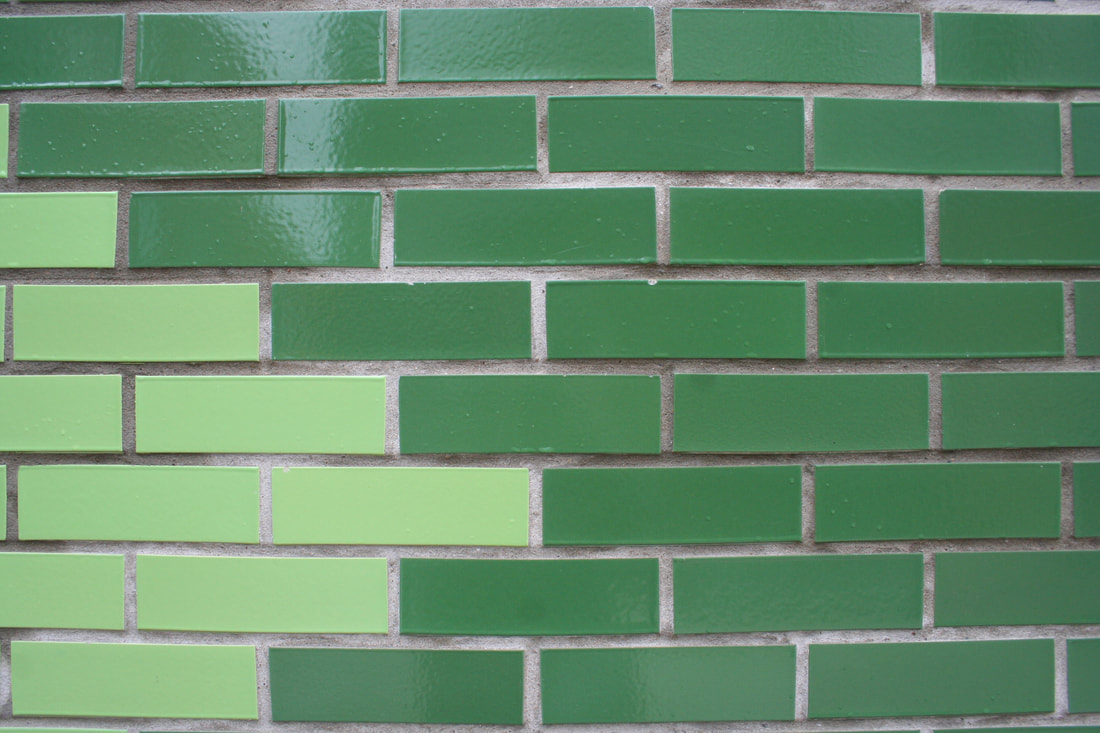
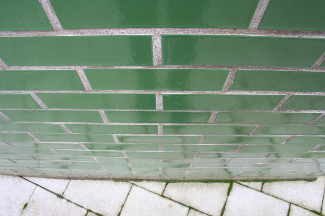
- An architectural photograph of a brick wall so that the lines of bricks are parallel/perpendicular with the picture edge
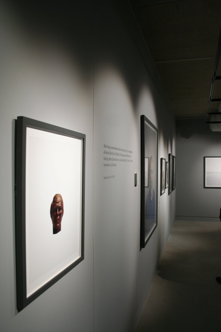
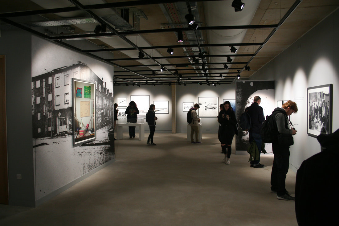
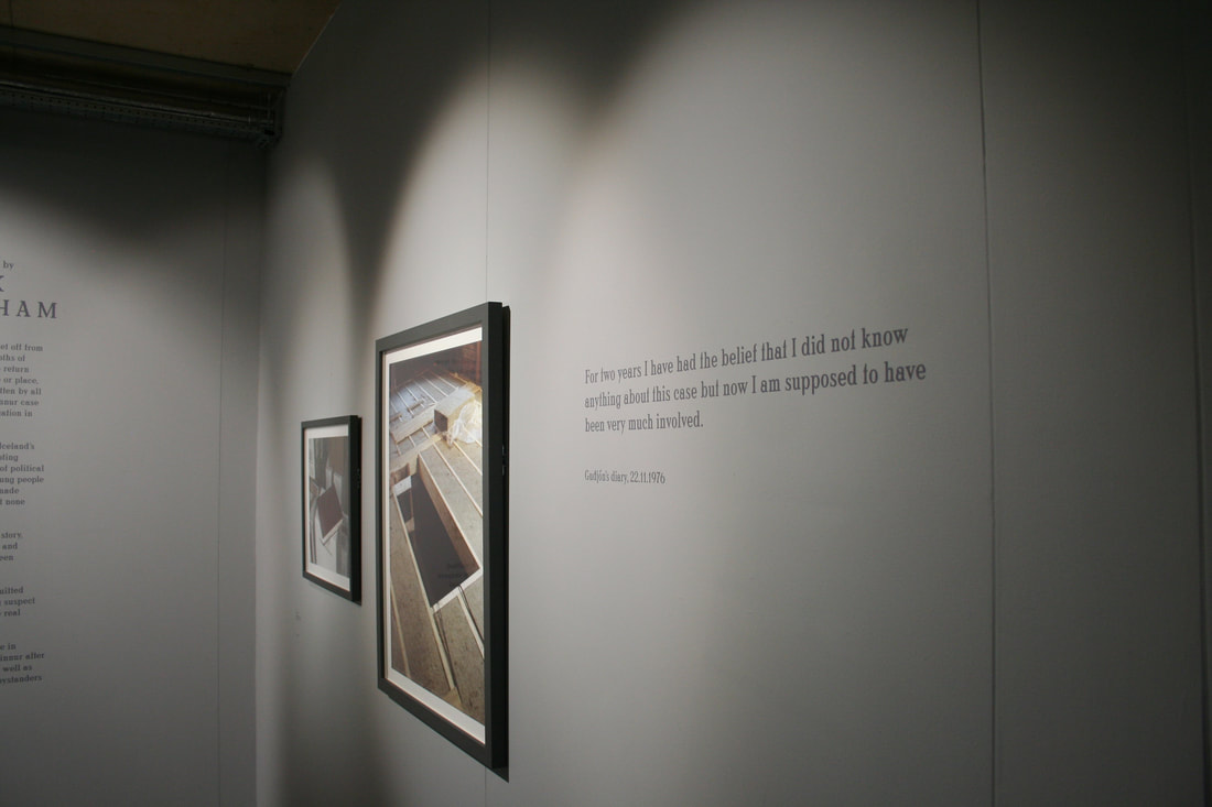
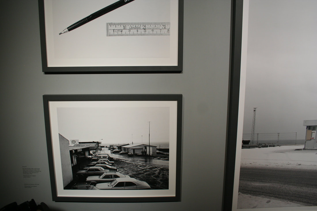
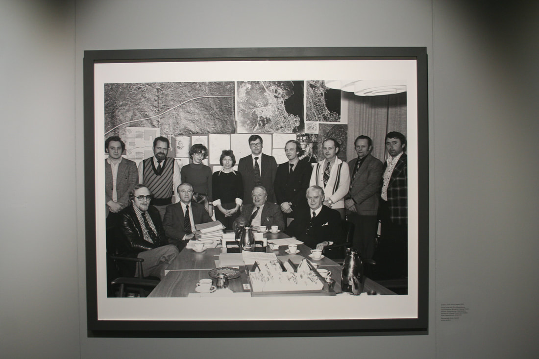
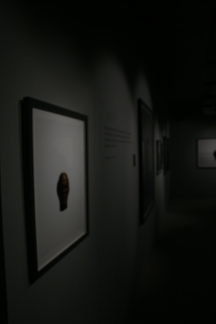
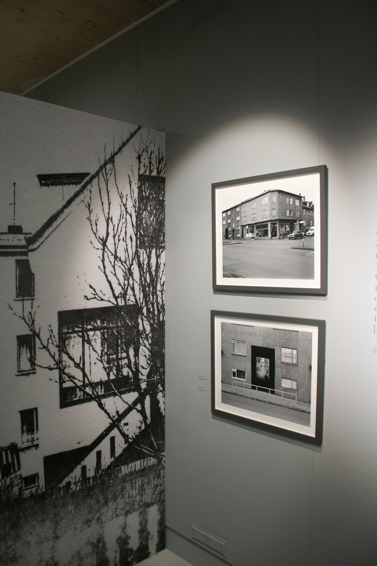
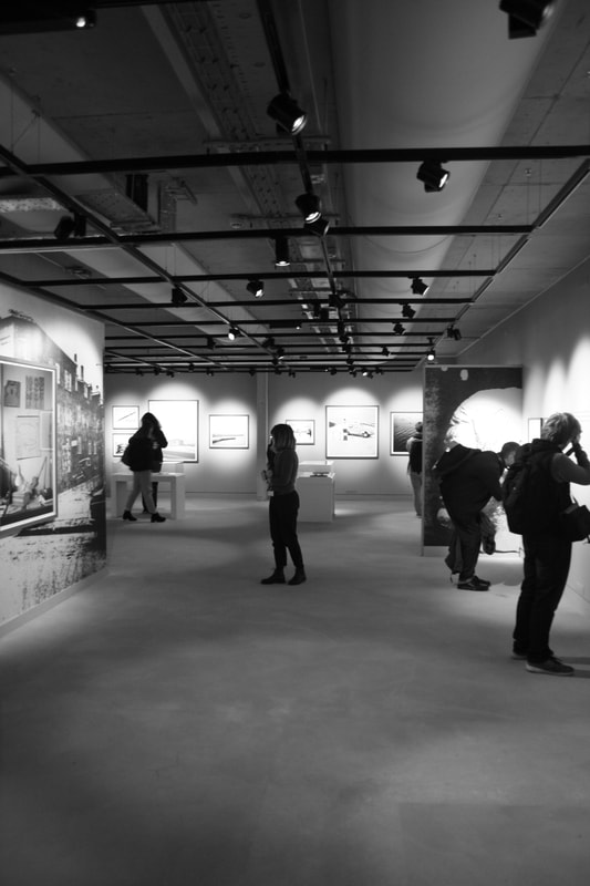
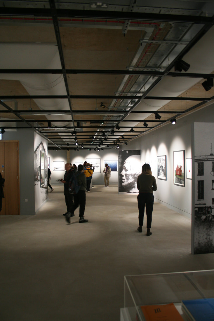
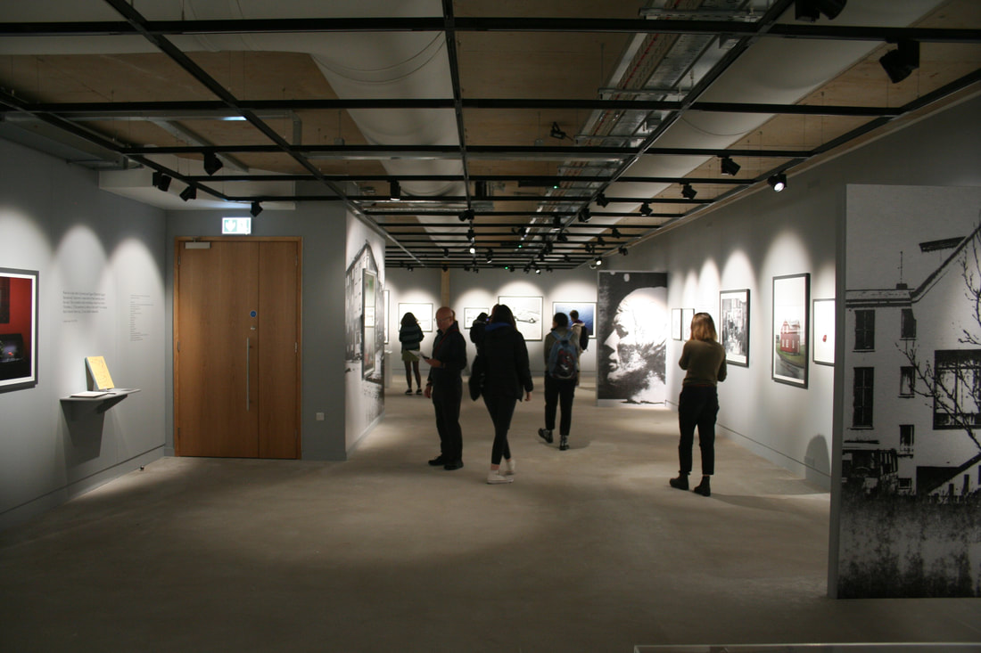
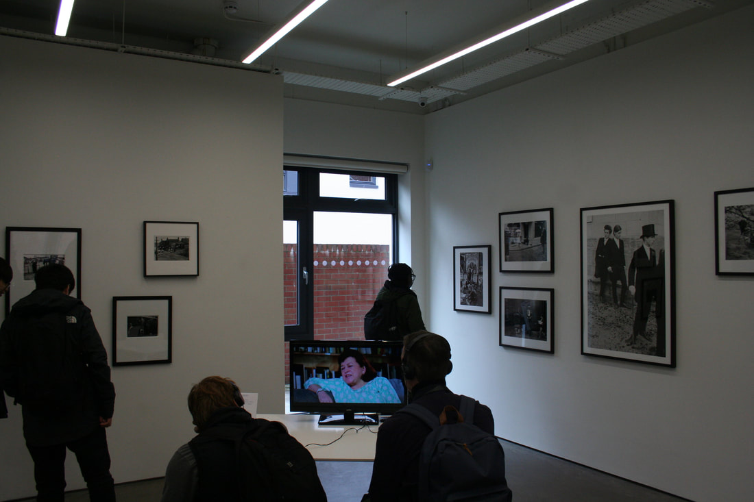
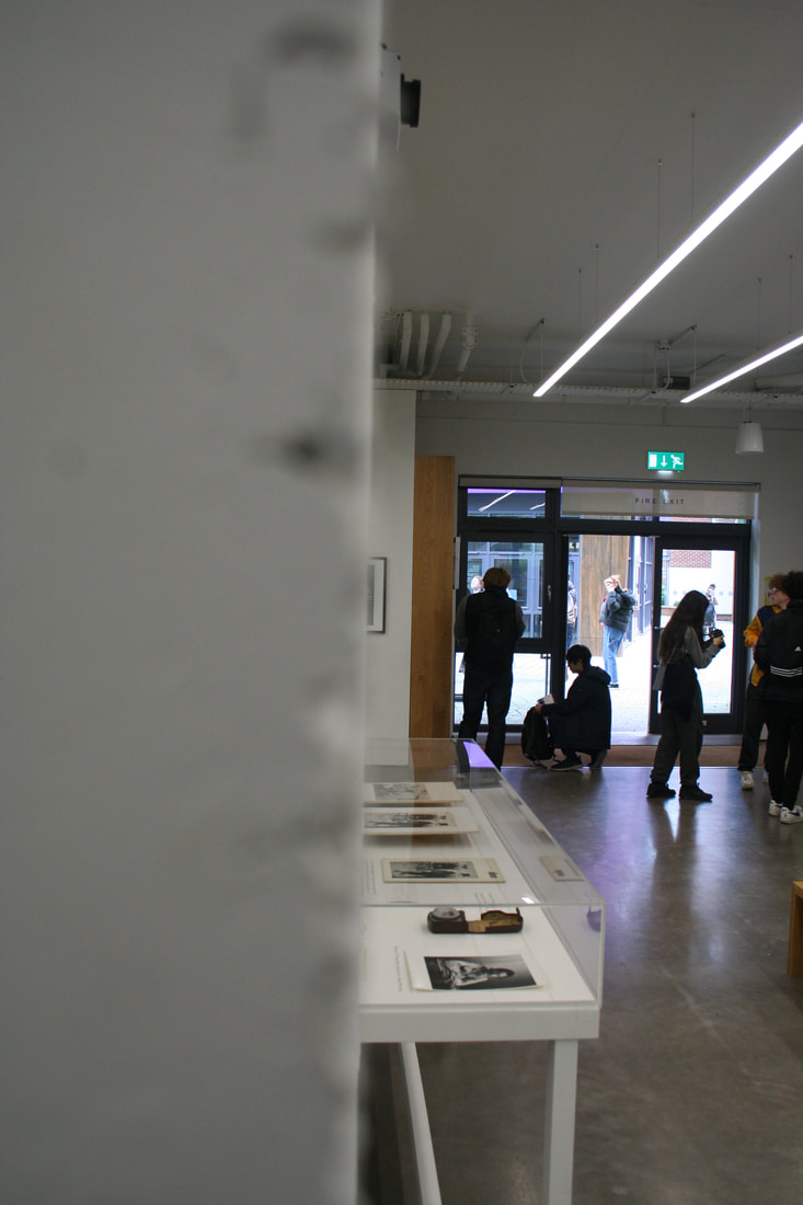
- An installation shot of the ‘Sugar Paper Theories’ exhibition, demonstrating an interesting aspect its design
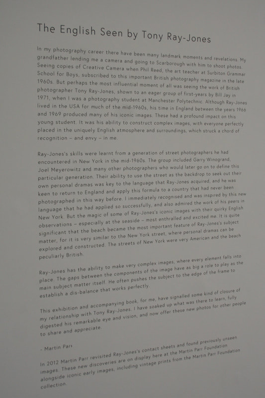
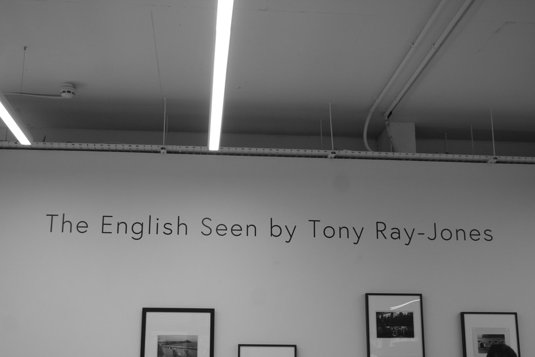
- A photograph of a section of the introductory wall text accompanying the Tony Ray-Jones exhibition
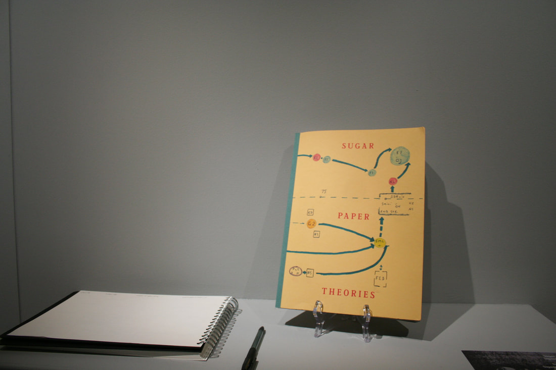
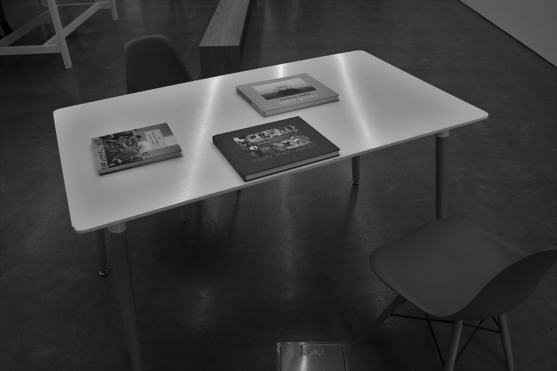
- A still life photograph of the ‘Sugar Paper Theories’ book
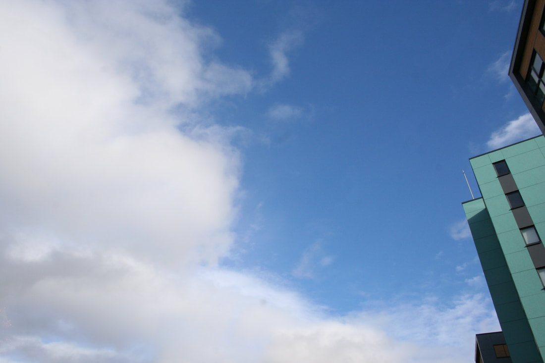
- A landscape photograph that is 95% sky
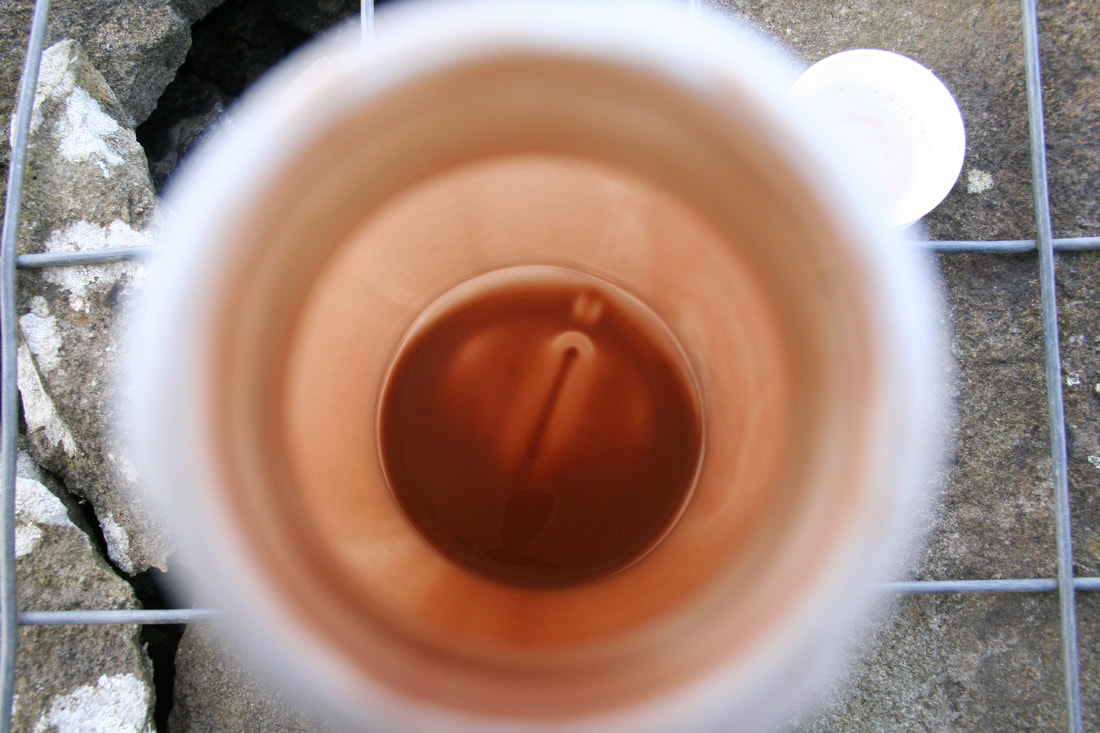
- A still life photograph of the inside of a dirty coffee cup
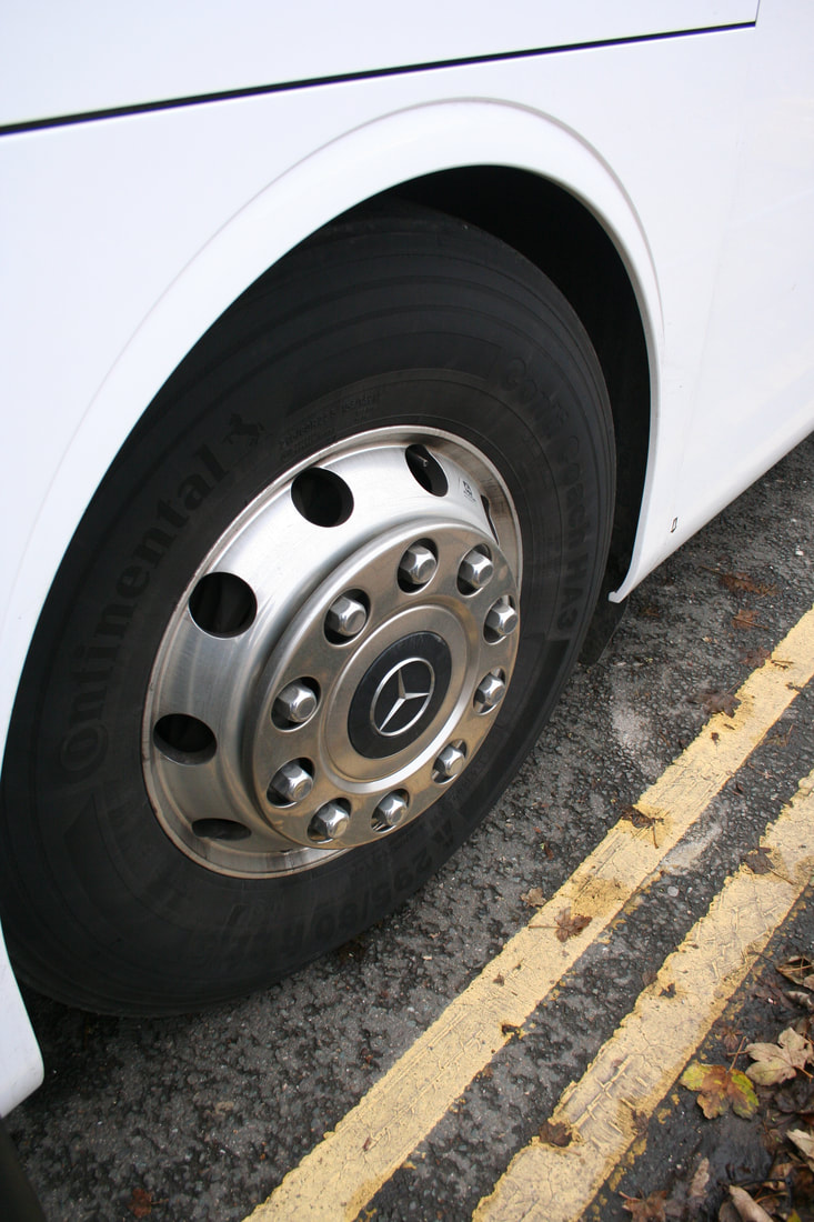
- A still life photograph of one wheel of the coach
- A low angle photograph taken underneath something

The Grey Area Final Exhibition
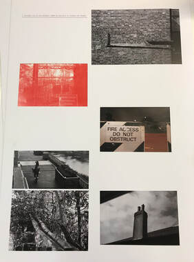
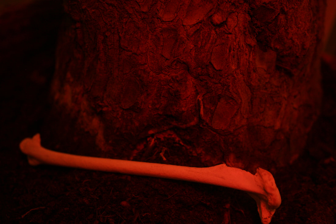
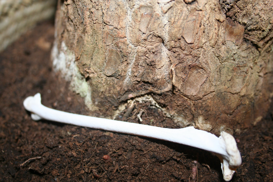
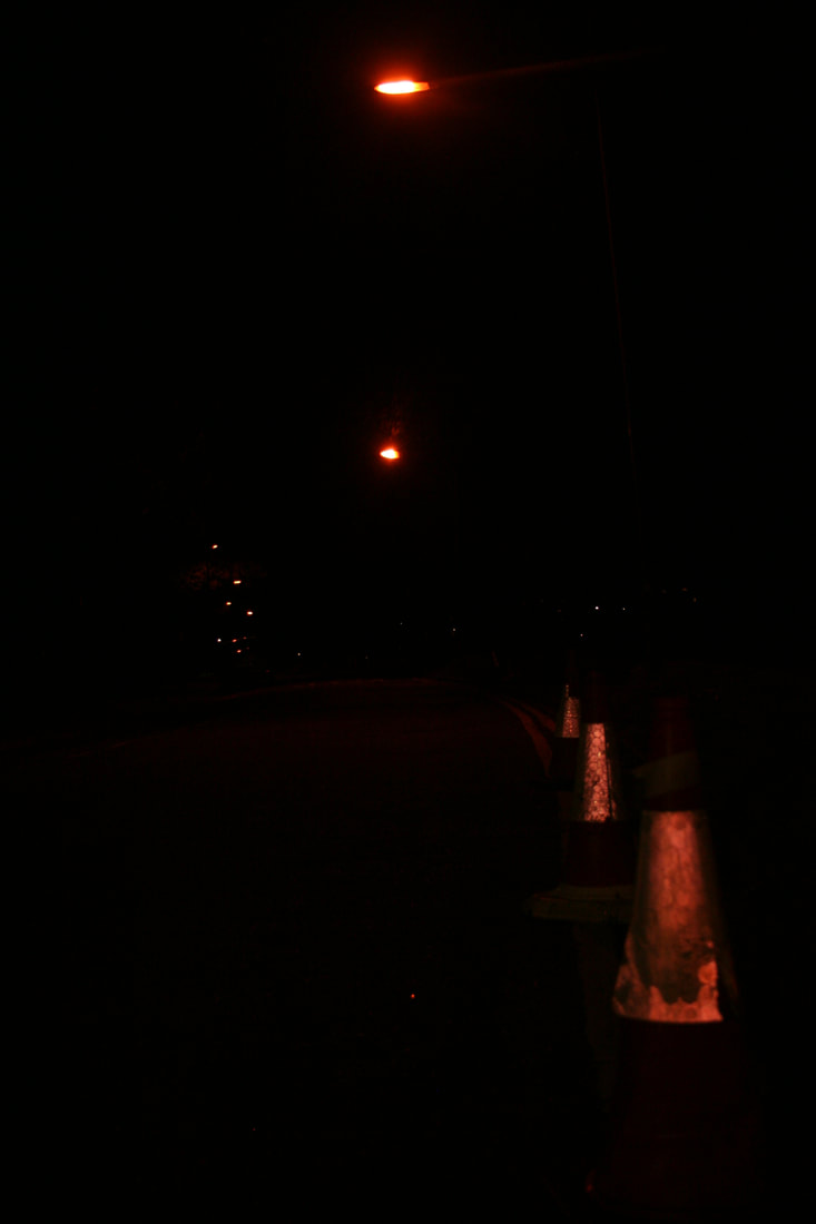
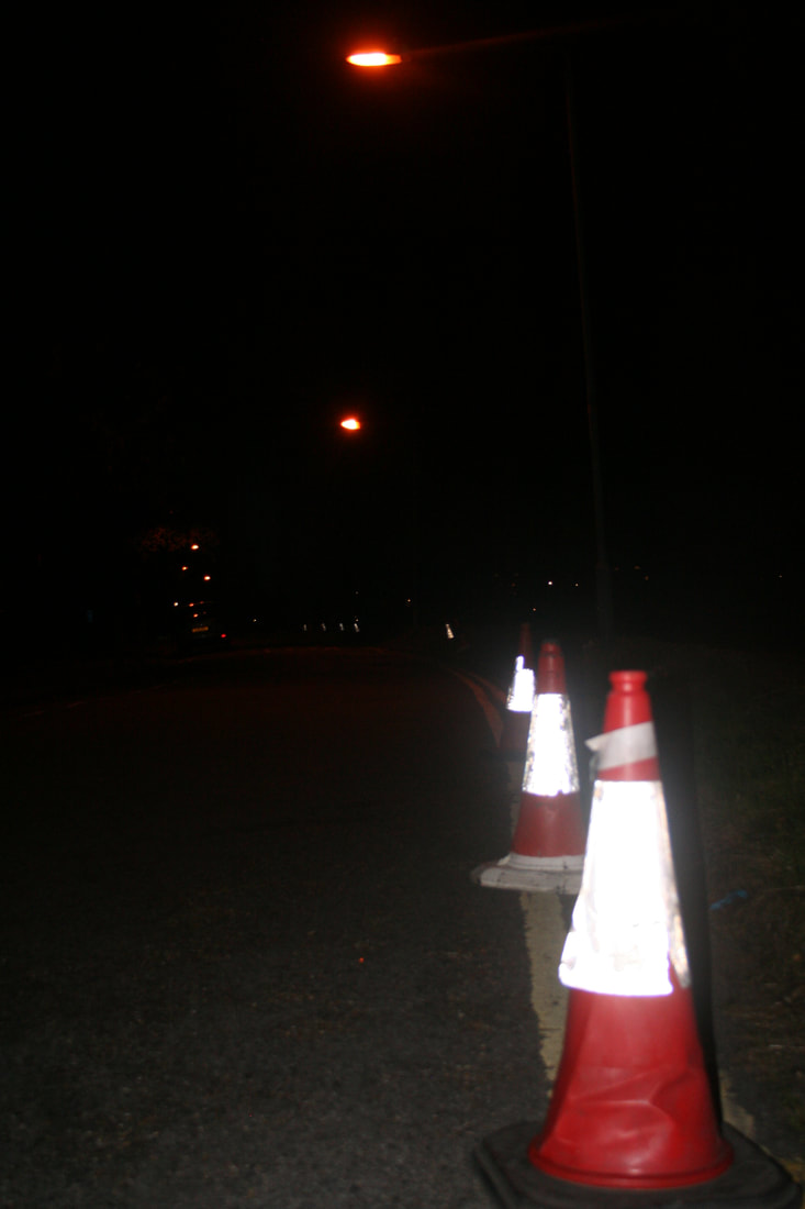
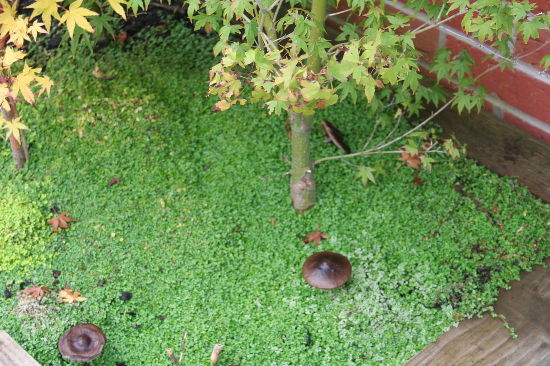
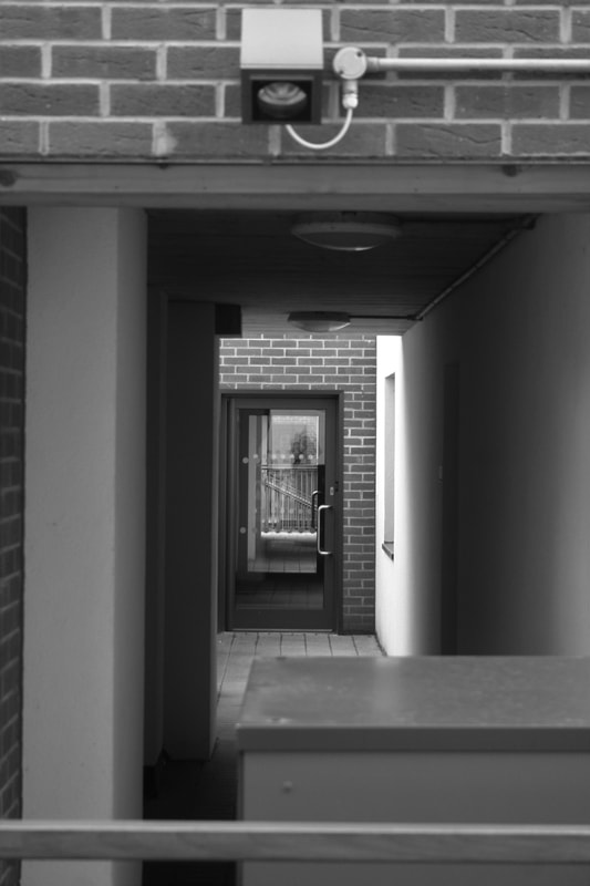
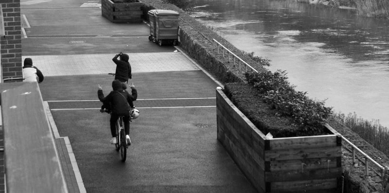
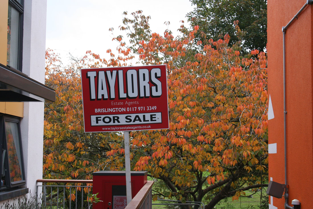
My view of the Grey Area is that it connotes life, freedom and danger. Life is represented by the living objects like trees and rivers but also phenomena like shadows. Freedom is represented by manufactured objects, such as a house, These objects are created by people who have the freedom to make decisions and express preferences. The final theme of danger is represented by the uncertain looking objects, for example the kids 'flipping the finger' or the various danger signs. I based my final piece of those 3 themes because they are quite vague. I can experiment with a lot of different 'threshold concepts' in the picture because those words give me the space and the ability to explore the Grey Area. Because those 3 themes are vague it allows the viewer to introduce their own ideas using my photos.
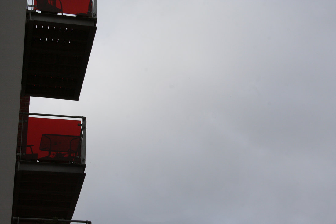
I introduced a quote that portrays the 3 themes and links them together. "Straight out of our mothers' wombs we are born to freedom and danger." When I am taking pictures of the idea of the Grey Area, the first thing that comes to my head is a black and white picture but it also depends on where I am taking pictures as sometimes colour can also represent the Grey Area just as perfectly. Only then I think about the contents of the picture. The pictures that I took in colour are all not vibrant and are largely monochromatic. There was only one picture that is used to represent something with a very strong and bright colour and that is the full red picture which signals mainly danger. In every single other picture what mainly matters is the content of it.
I used my intuition when deciding the size and the layout of the photos, when selecting the the constraints I thought to myself of what looks good and what shows my style. Only then I viewed the layout in a way that could link the ideas together and portray life, freedom and danger. My layout has a structure and at the same time a chaos as it has different sizes and gaps between the picture and yet it is still neat. My layout also has a sequence. You first see all of the pictures together and not in detail, then you wonder what does the quote say, and finally you inspect the pictures in detail. With that sequence over you can observe and think about the whole idea and theme of the project.
I really like the way the final piece turned out, I think it perfectly portrays my ideas and shows my ambition and control in photography.